
Home, Banking and Investment App
Locations
Los Angeles, California, USA
Industry
Proptech
HomeWyse is a mobile app, which allows users to manage their homes, transparently see the available equity grow transparently compared to the traditional mortgage alternative, and move to a new home easily when wanted.
Problem
Millions of American families across the income spectrum are locked out of homeownership.

Solution
We have designed an app to provide American families with a convenient and stress-free way to search for, finance, and move into their new perfect homes. This solution streamlines the entire home-buying process, offering essential tools and resources.
Rapid Prototyping
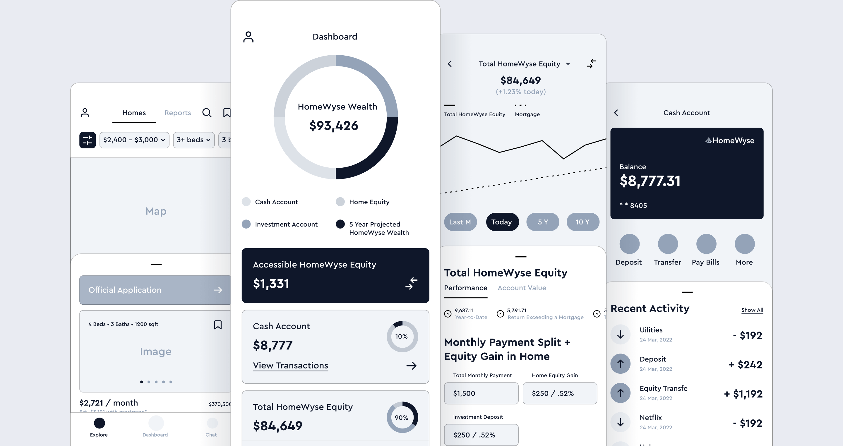
Wireframes are the skeleton of the application interface. They show the structure, content, functions of the screen. Rapid prototyping is a part of every project once we have a clear understanding of the problem and user needs. We designed a quick prototype to get feedback and validation. This made it possible to improve the quality of the application and reduce the risk of creating something that no one would like to use.
Features
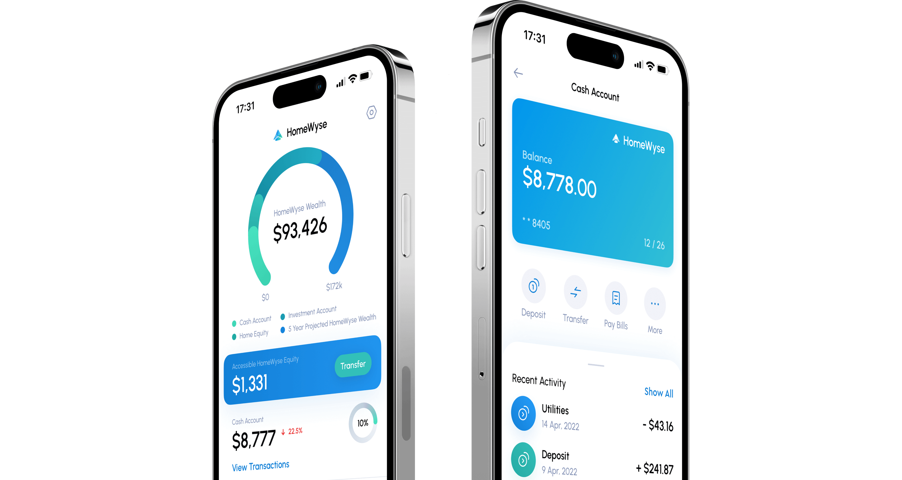
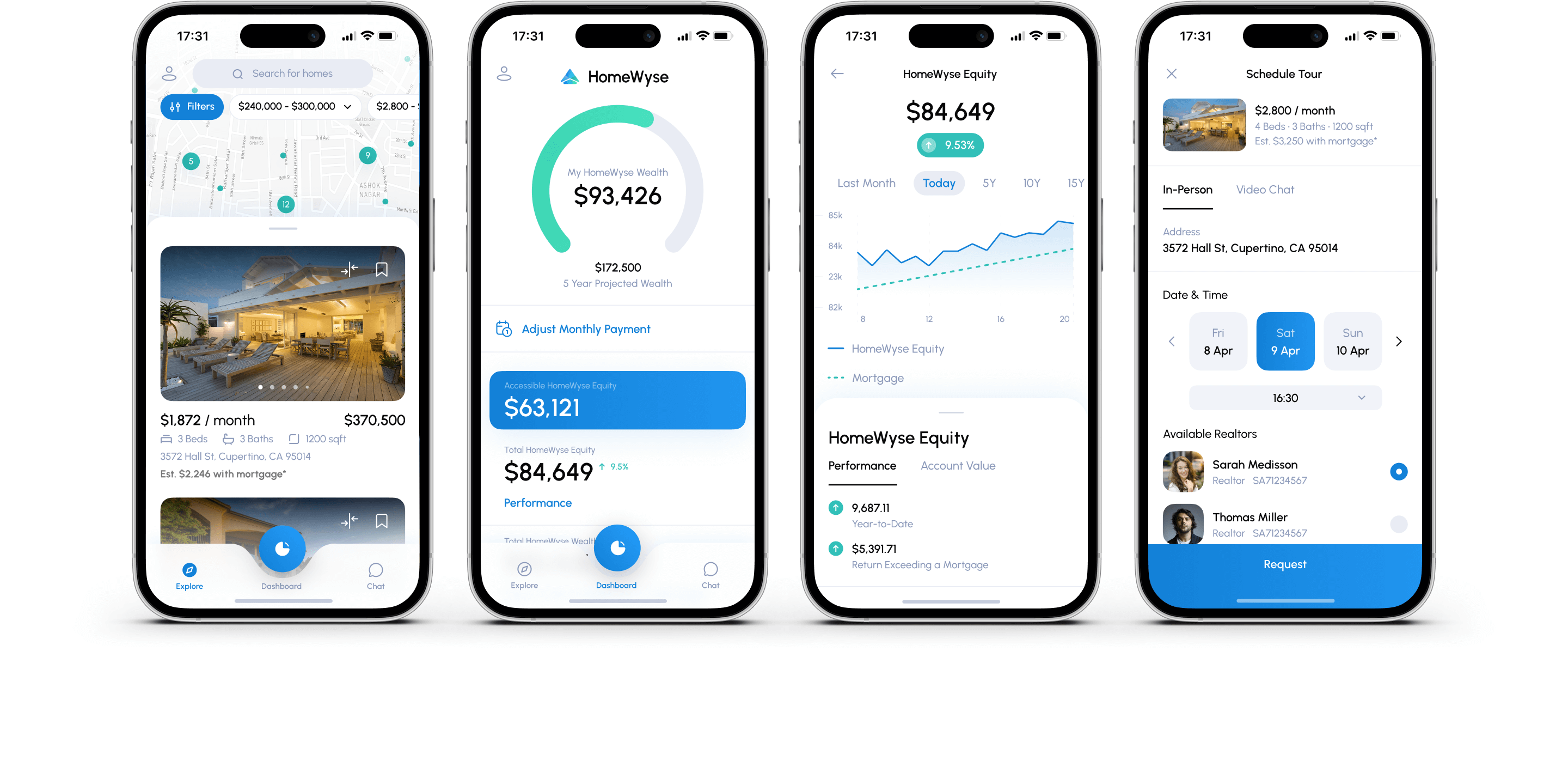
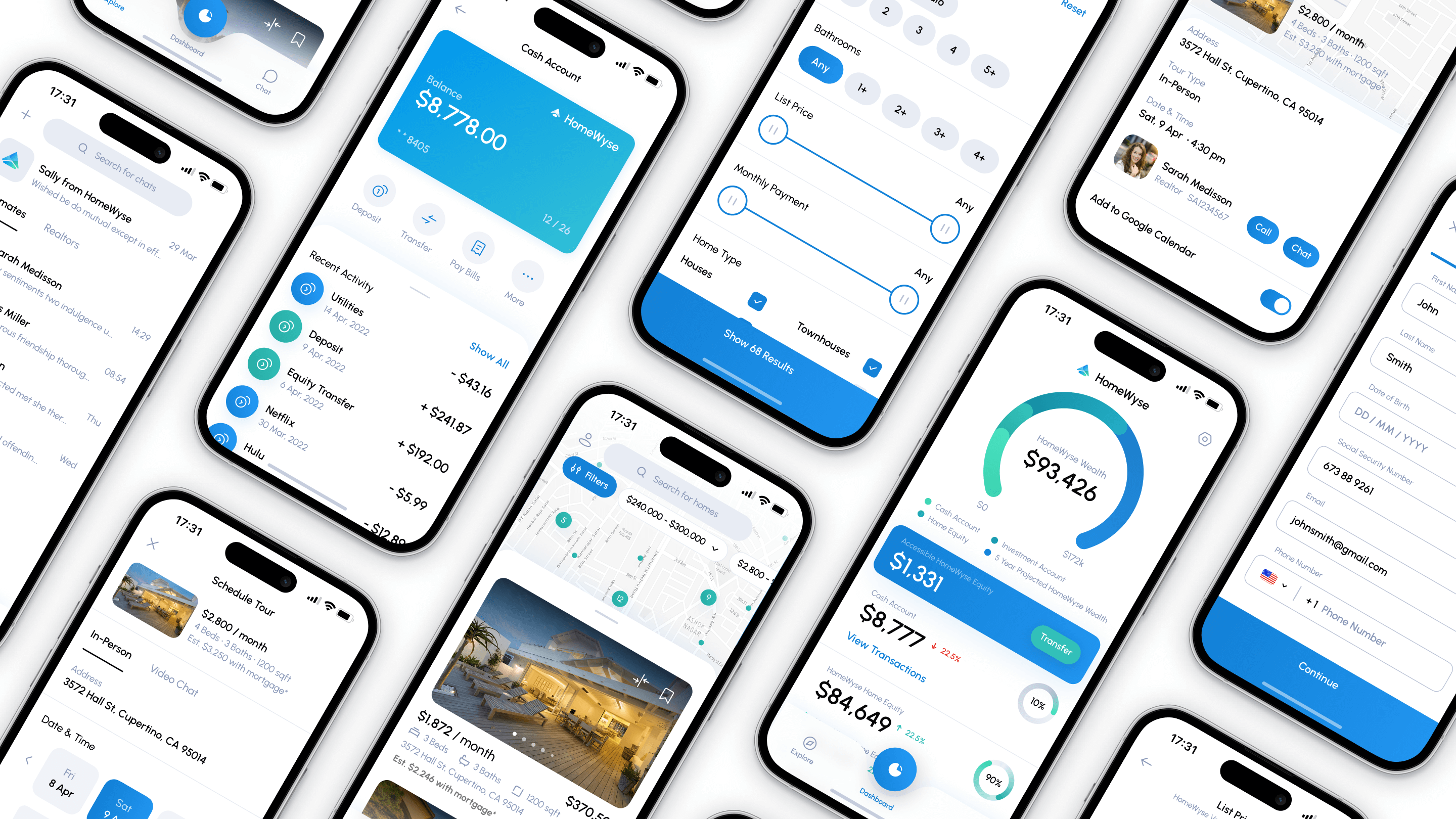
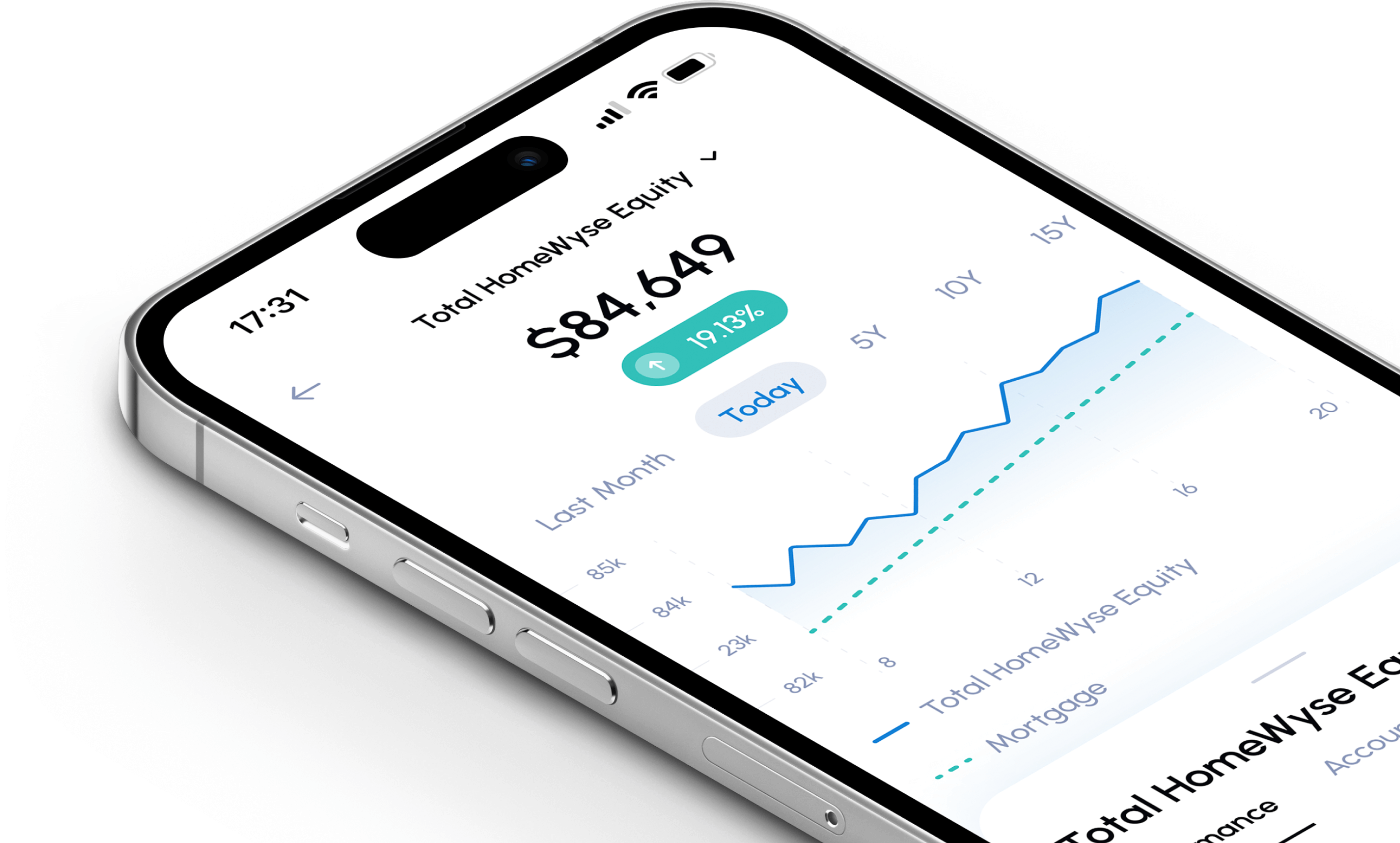
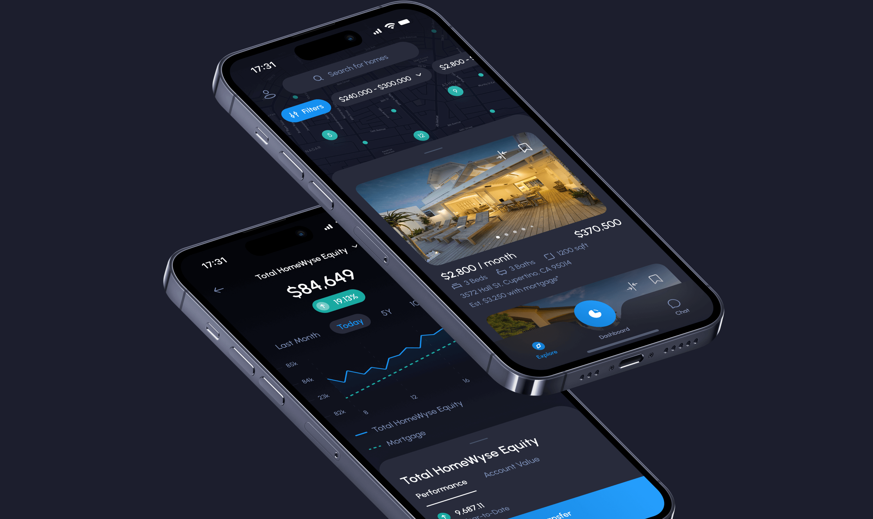
The app has a wide range of features and it could be treated as a lifetime home passport as well as digital banking and investment platform. The home dashboard is where the users can keep track of their monthly payments, home equity assets, cash savings, and investment assets. Moreover, it could be a great place to keep track of all the financials.
User Experience
In the early stages of designing the application, we created a Userflow, which helps in creating the path the user will take to achieve the desired value, as well as identify potential problems that may arise during the use of the product. Each flow consists of several interactions because the interface screens offer several possibilities. We visualized user interaction with the interface in an understandable way. Userflow not only helps to design the best interaction with the user but also ensures the convenience of working with the product.

Interactive High Fidelity Prototype
Each project designed by us undergoes thorough testing. An interactive prototype not only helps to testing the interface and learning how users can perceive the application but also serves as a catalog for the entire team and speeds up product development. An interactive prototype is similar to a live application and allows the user to behave more naturally during testing.
Visual Design
The combination of clear and understandable UX with eye-catching UI makes the product desirable and valuable. We aimed to create a light and clean interface using a palette of blue and green colors to fit the company's style. The Urbanist font and crafted icon set complemented our vision of how the modern and easy-to-use app should look like.
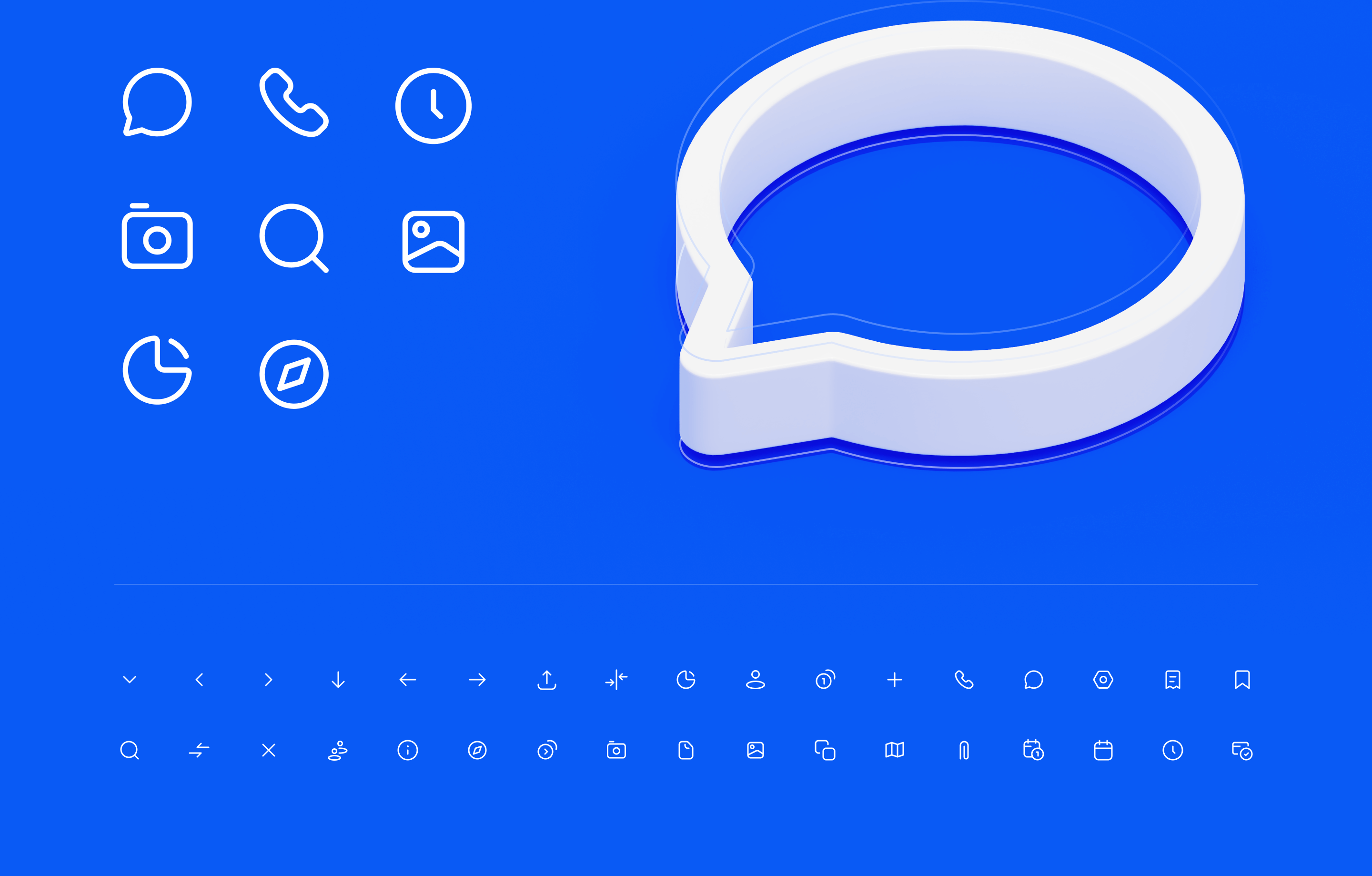
Icon Font
Icon fonts scale a vector, that is why we use this technology in our apps. When designing icons, we follow the same stylistic rules in order to achieve harmony in the icon family. Each icon created by our team has its own visual weight. The weight of the icon is determined by parameters such as fill, stroke thickness, size and shape. Preservation of these parameters ensures consistency and unity of style.
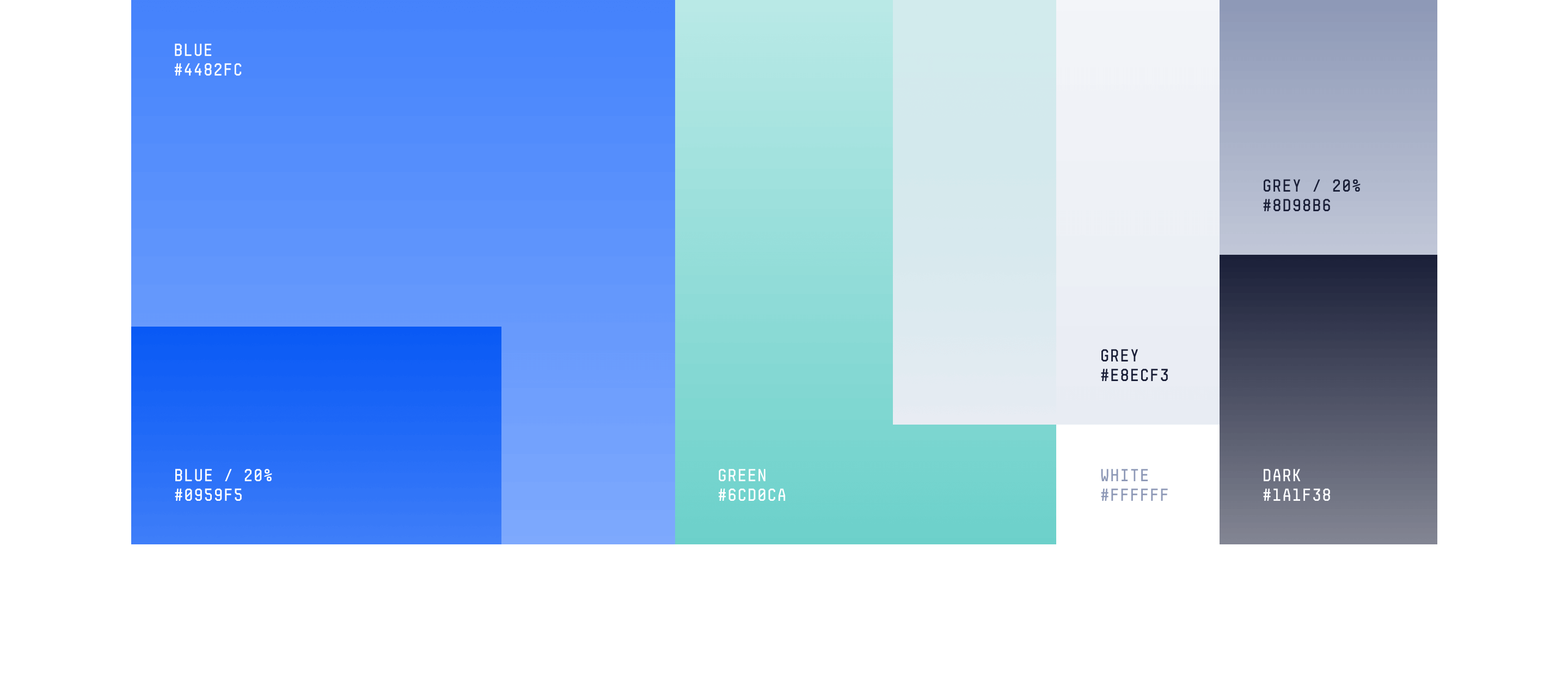
Color Scheme
Our team is always inspired by nature when choosing a color scheme because the human eye expects the color they know in the real world. All color behaviors comes from nature, for example, the color of the sea can change from blue to turquoise. Using the contrast of the palette, we separated the elements without overloading the composition and gave the interface dynamism, and harmonious colors give the interface elements a logical meaning.
Typography in Interface
We pay special attention to typography in interfaces. It's much more than just choosing an attractive font. Good typography in interfaces improves app usability, readability and comprehensibility, one of the important problems it can also solve is accessibility.

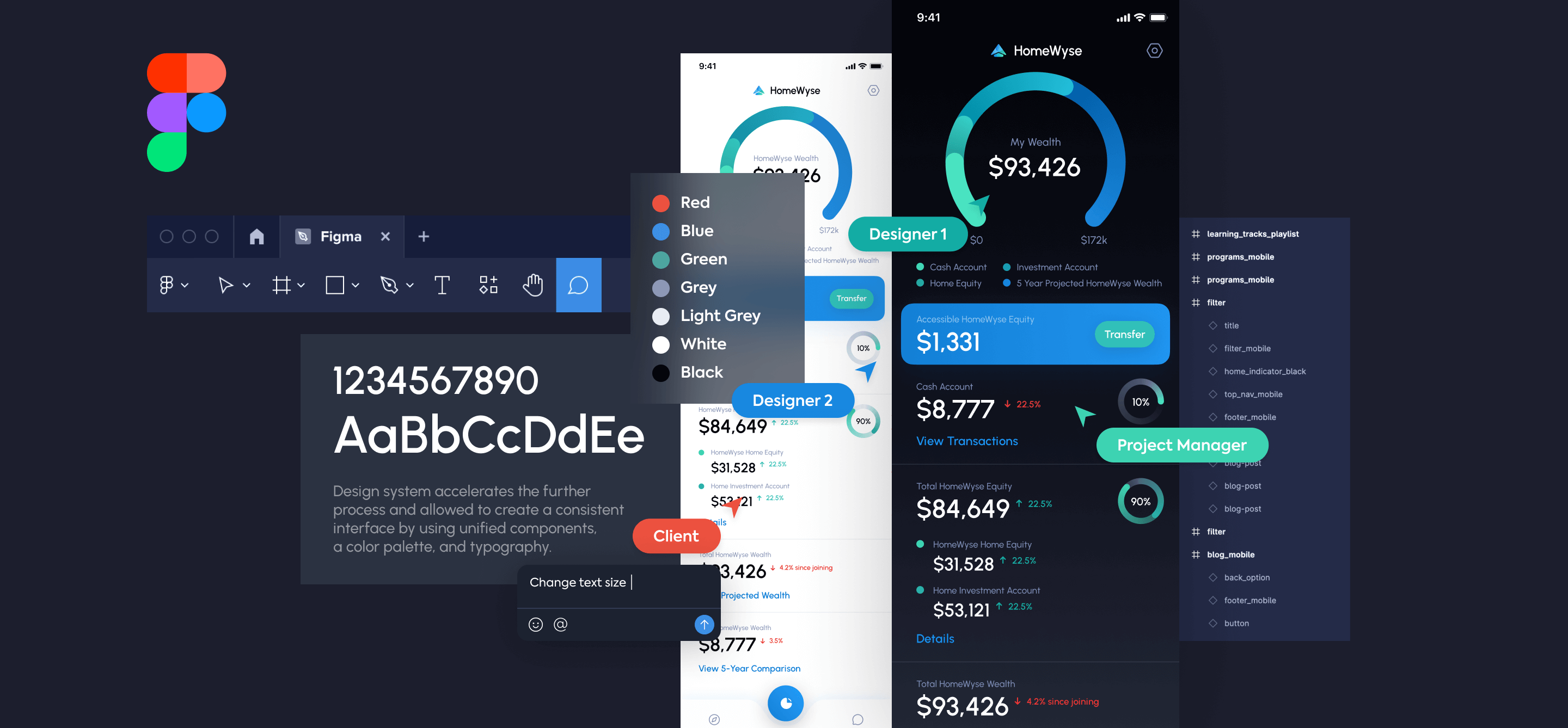
Design and Collaboration Tools
While working on a product, we use Figma as our basic tool for development and collaboration. This tool unites the work of the whole team and helps create a system design, interactive prototypes and components. In our projects, we always use components that allow us to reuse existing parts of the interface, saving time on rework. This allows us to build things faster and more consistently without blocking our ability to be creative and solve new problems.
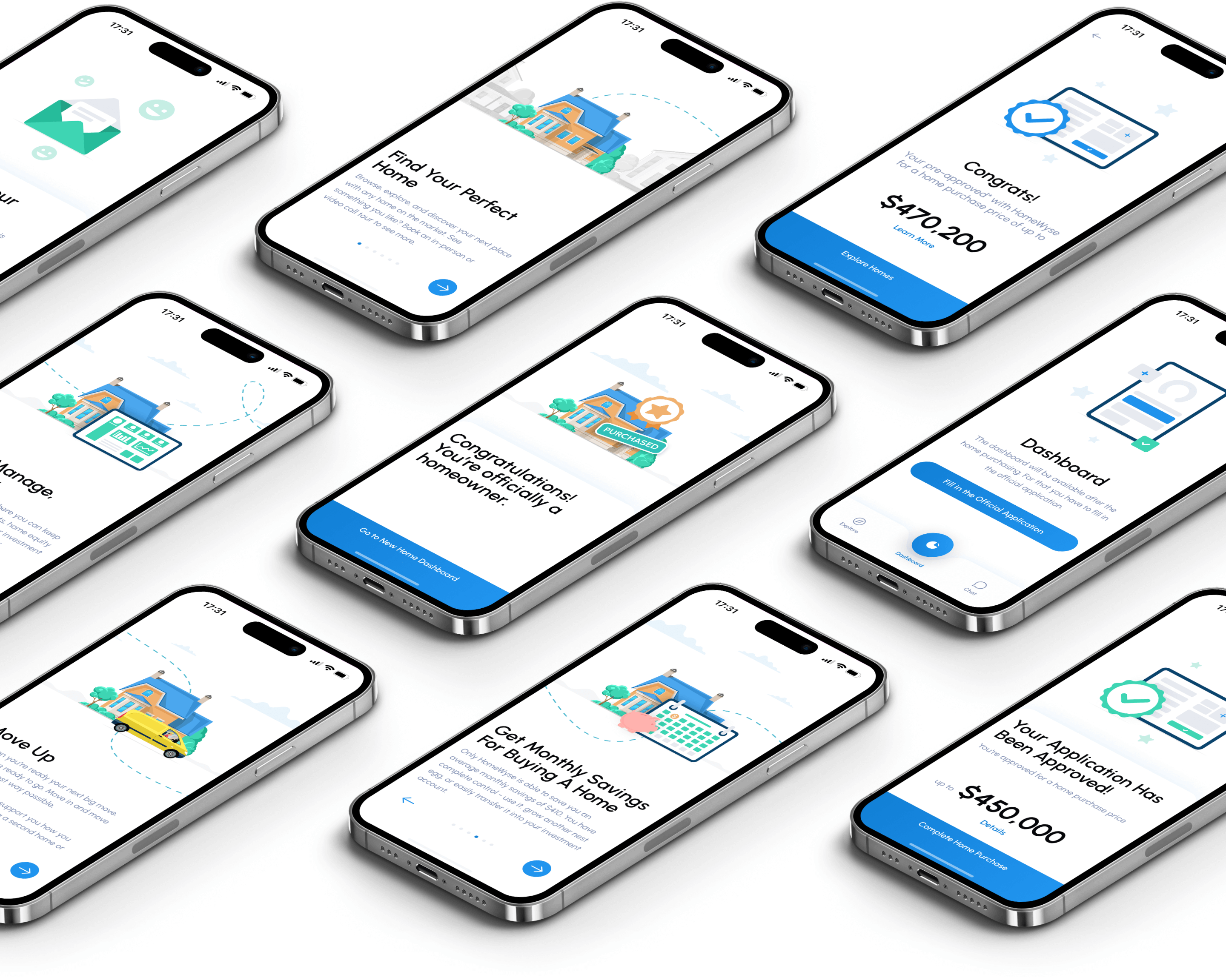
User Onboarding
User Onboarding is much more than 5 introductory screens and explanatory tips in a mobile app. This is the first point of contact of the user with the application and a rather, an important stage of interaction and the process of adaptation, with the help of which the user gets acquainted with the main functions of the application.
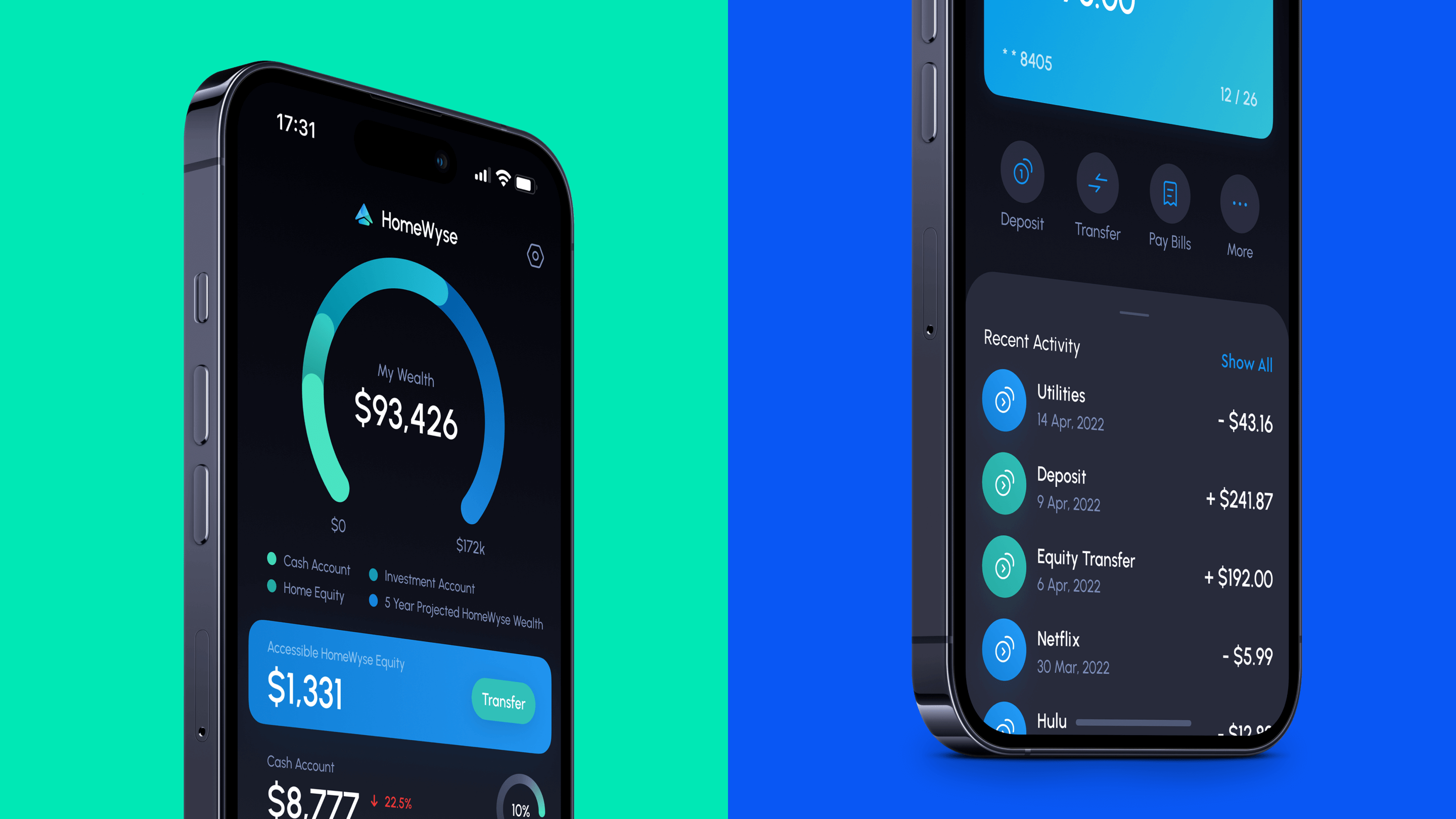
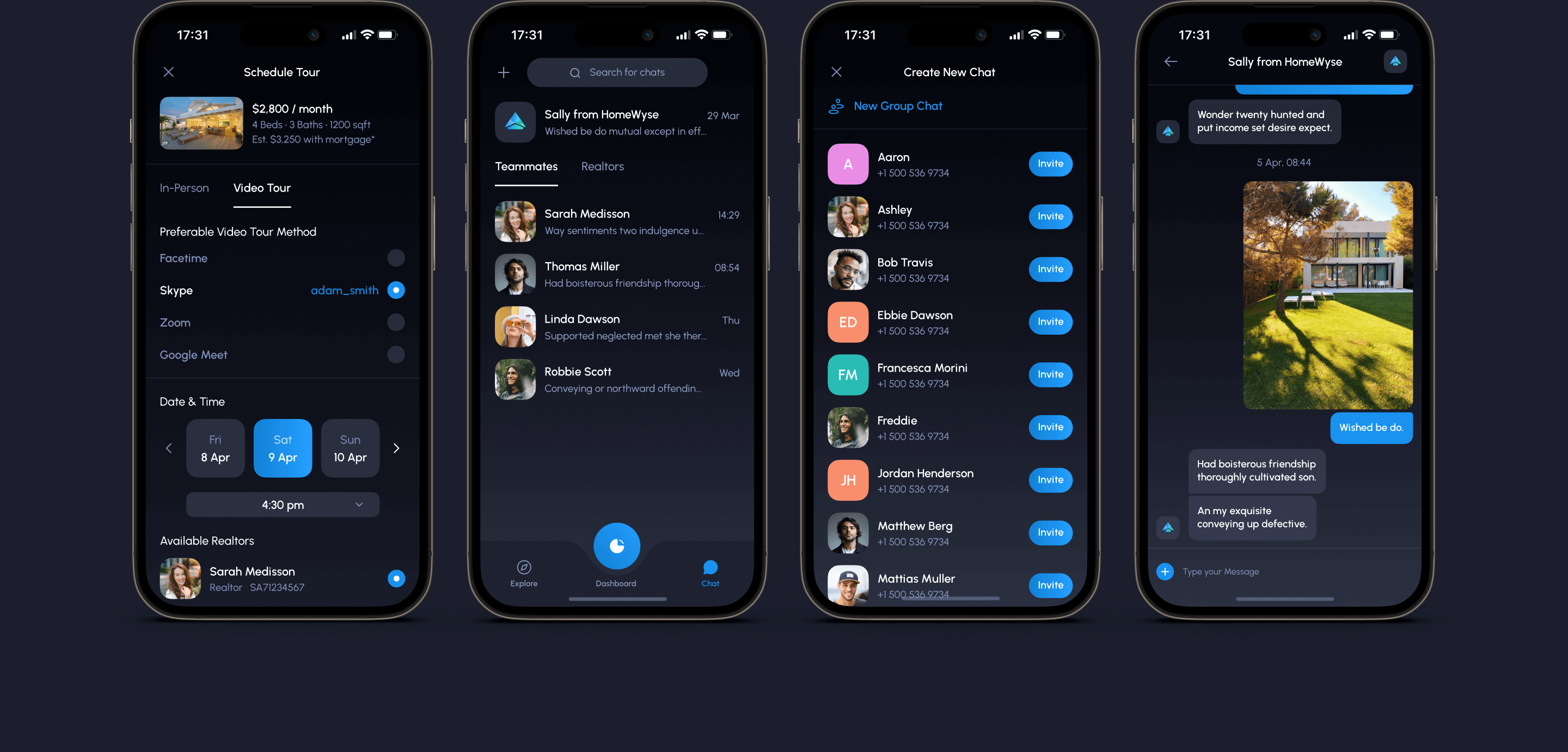
Dark Mode
At Roxman agency, we have a rule to always create an additional dark theme for the application interface, as it is currently a sign of a high-quality application. The dark theme reduces eye strain in low light, and significantly saves battery consumption. We've created a darker color palette for all screens, views, menus, and controls to make using the app even more comfortable at night.
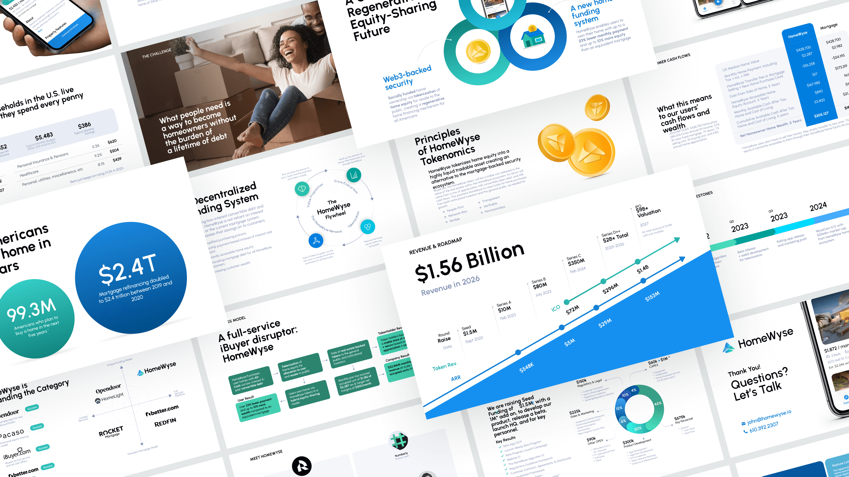
Pitch Deck Presentation
During the creation of the presentation deck, we were guided by the fact that the presentation is data-oriented and gets to the point much faster than a classic presentation. Reading information takes place in a matter of minutes, and visualization should not prevent studying the problem and the solutions that can solve it.
Summary
Initially, the application was designed for real estate purchasing, financing, capital management, and more, but during the design and testing process, we realized that users perceived the application as a home passport, digital banking, and investment platform. We rethought the problem and adopted several new approaches during the design process. It was an interesting journey in which we gained invaluable experience regarding user interactions with the interface and enjoyed fruitful cooperation with the client.
Client Feedback on the Clutch

Contact us for more information on our services, for answers to questions or to order a design project.