
App for Ordering Food
Locations
Saudi Arabia
Industry
Food Delivery
Shawarmer is a mobile app, created for ordering food from a large network of restaurants in Saudi Arabia. With it helps the users track their orders, make group orders, earn loyalty points, exchange them for gifts and much more.
Problem
Shawarmer's mobile app and kiosk system faced challenges in user experience and interface, needing a comprehensive re-evaluation to enhance customer interaction and engagement.
Solution
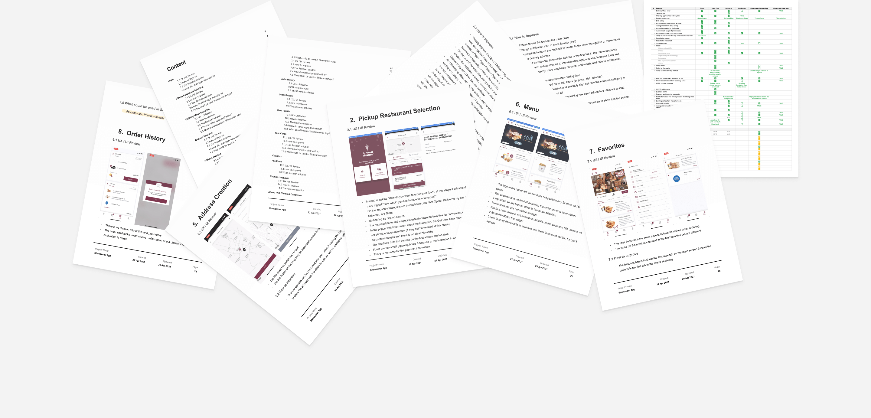
We conducted a thorough audit of the app’s UI/UX, assessed user feedback, compared industry standards, and participated in client interviews. Following our research, our team proposed a redesign that included user stories, information architecture, and customer journey mapping. The redesign was validated through prototyping and usability testing, ensuring its alignment with user needs.
Redesign
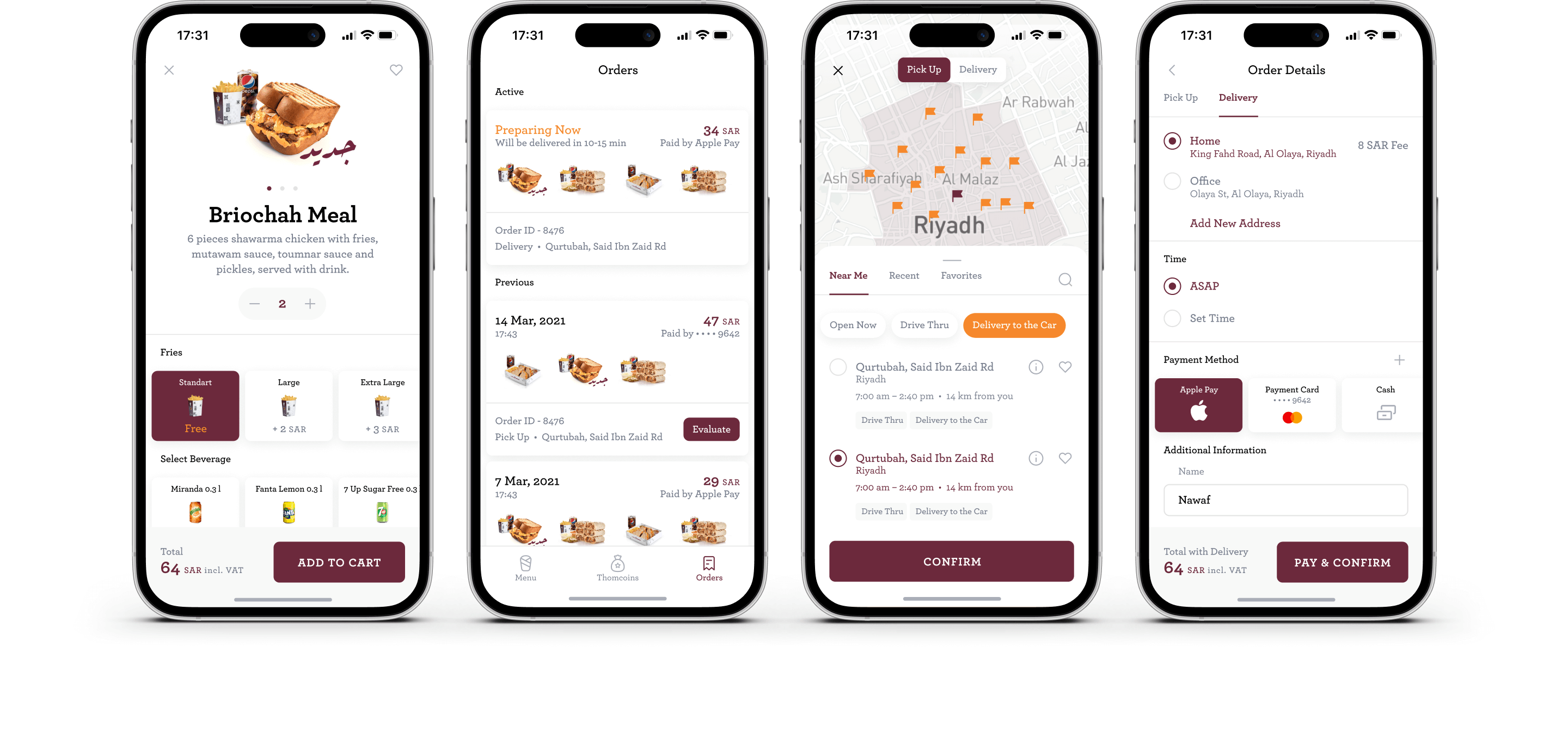
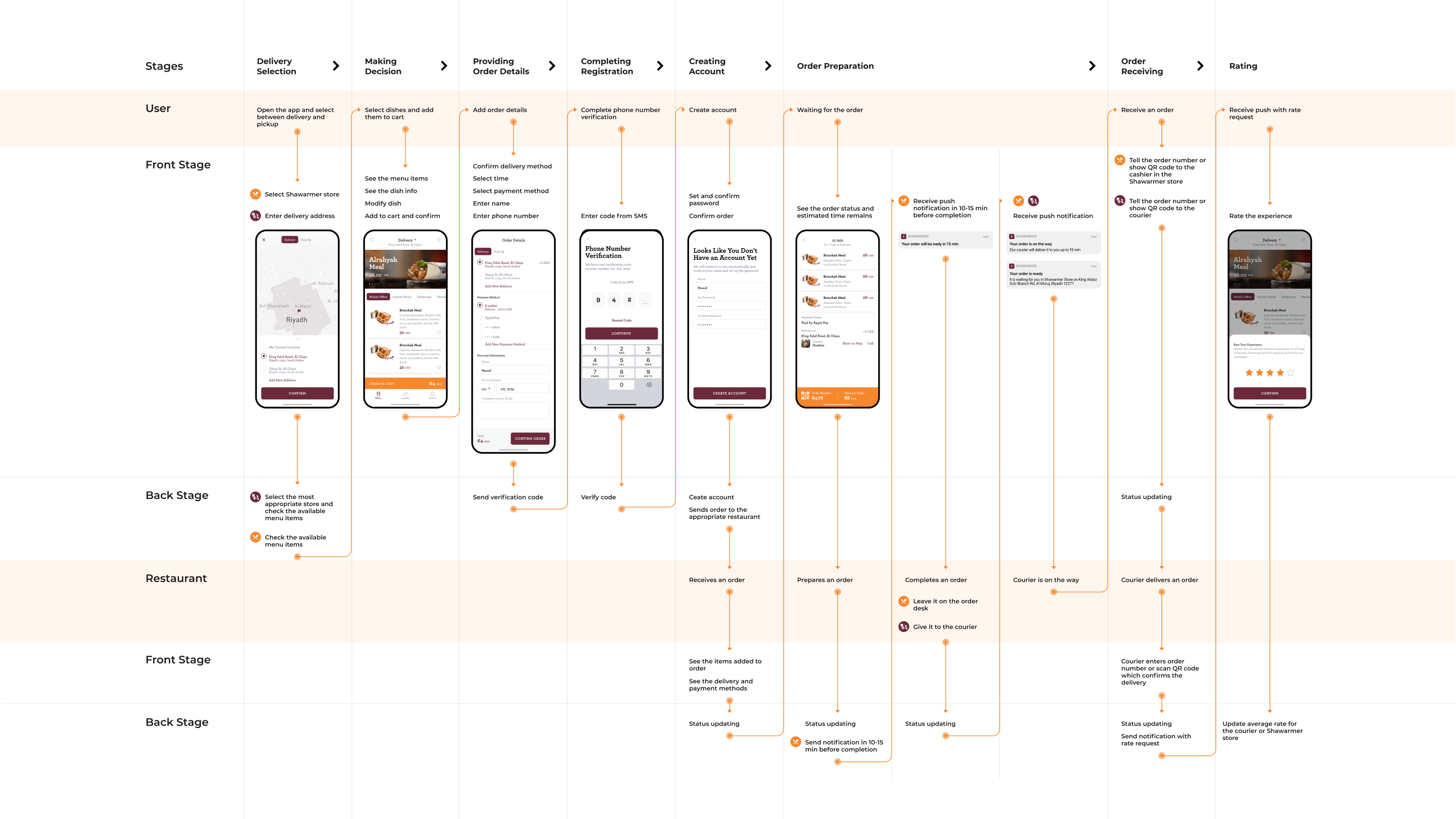
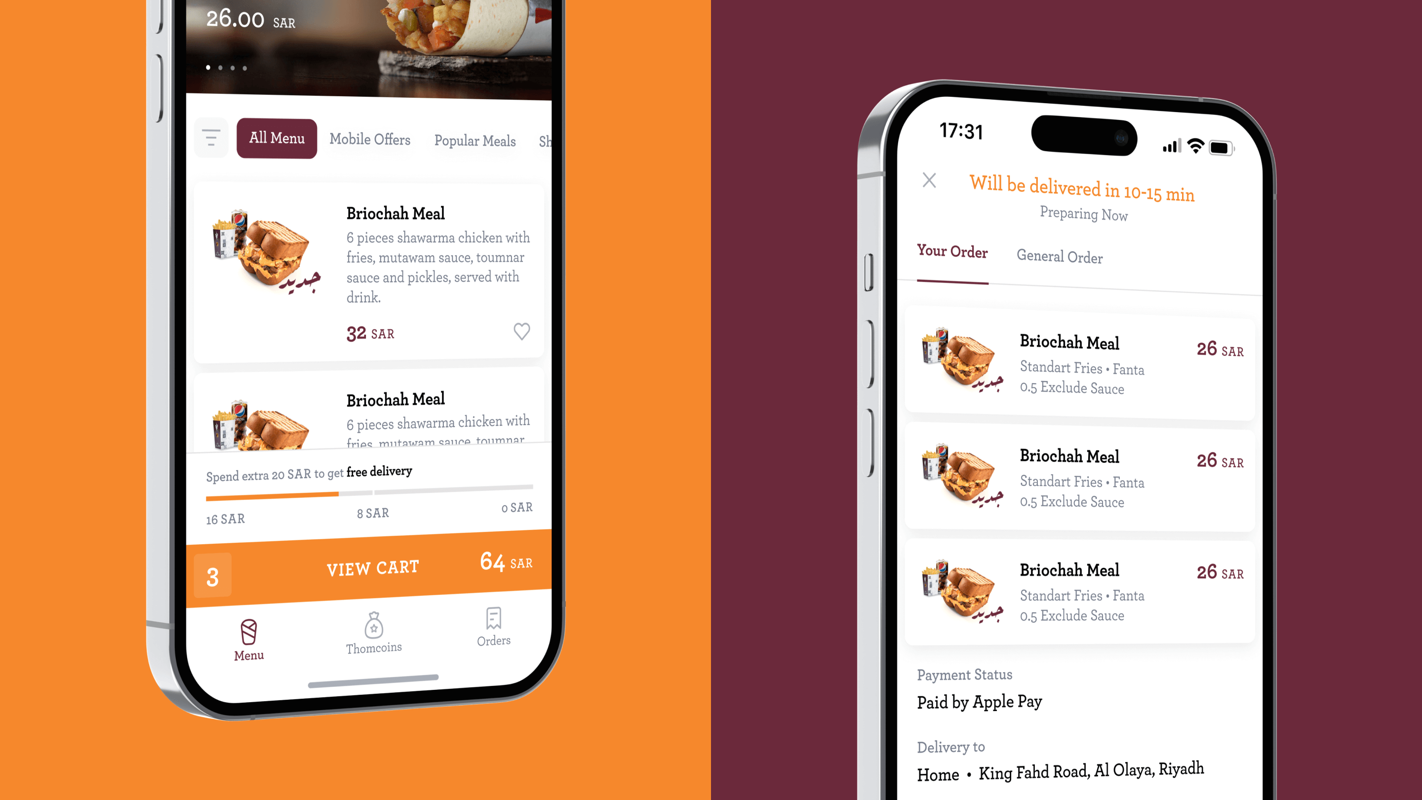
Our task was to completely update the existing mobile app - make it look fresher and become more useable. At the same time, we had to add a lot of new features for which we've found some interesting solutions. To understand better how all of the processes have tto tinteract with each other, we used the blueprint technique.
New Features
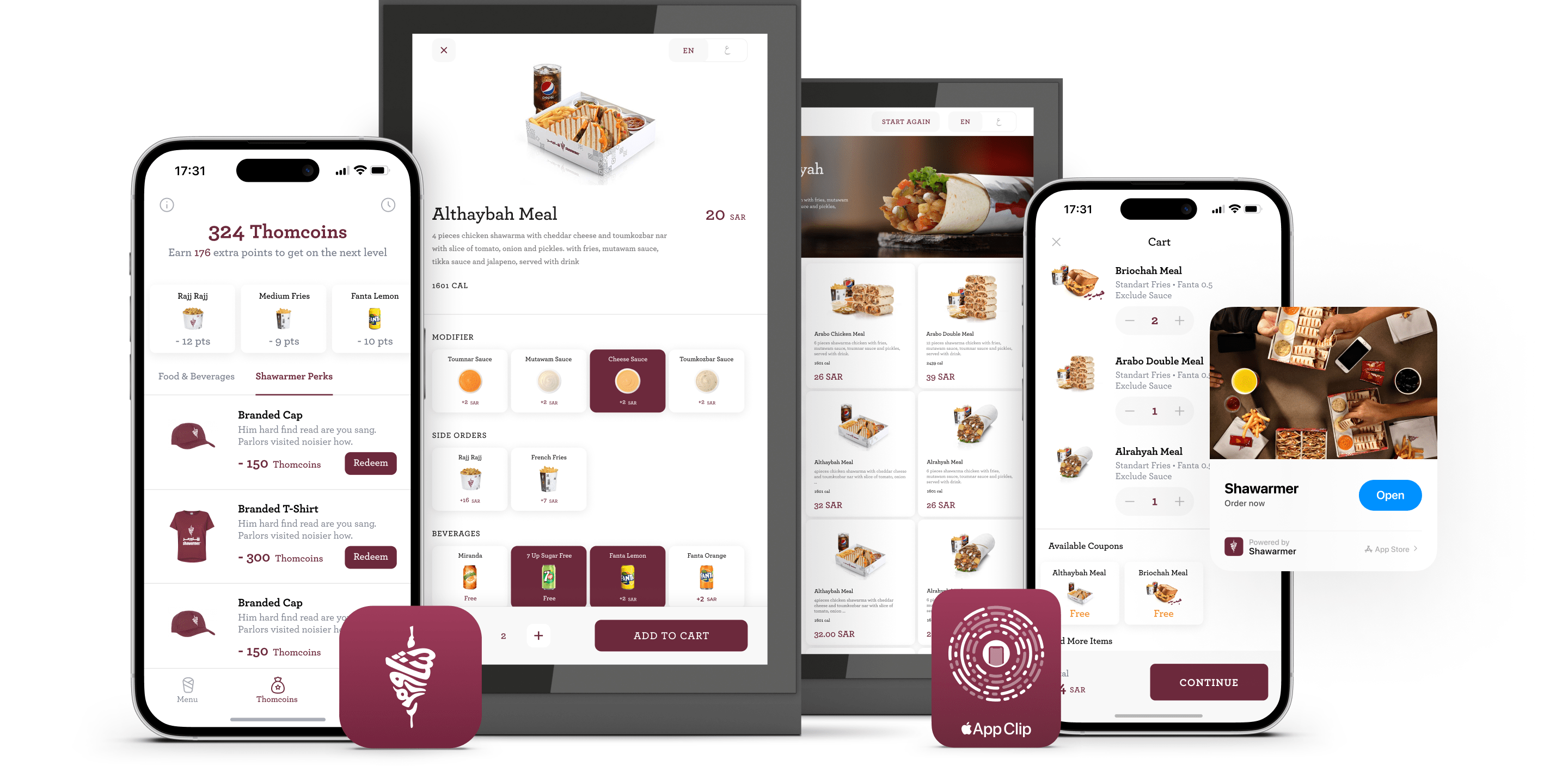
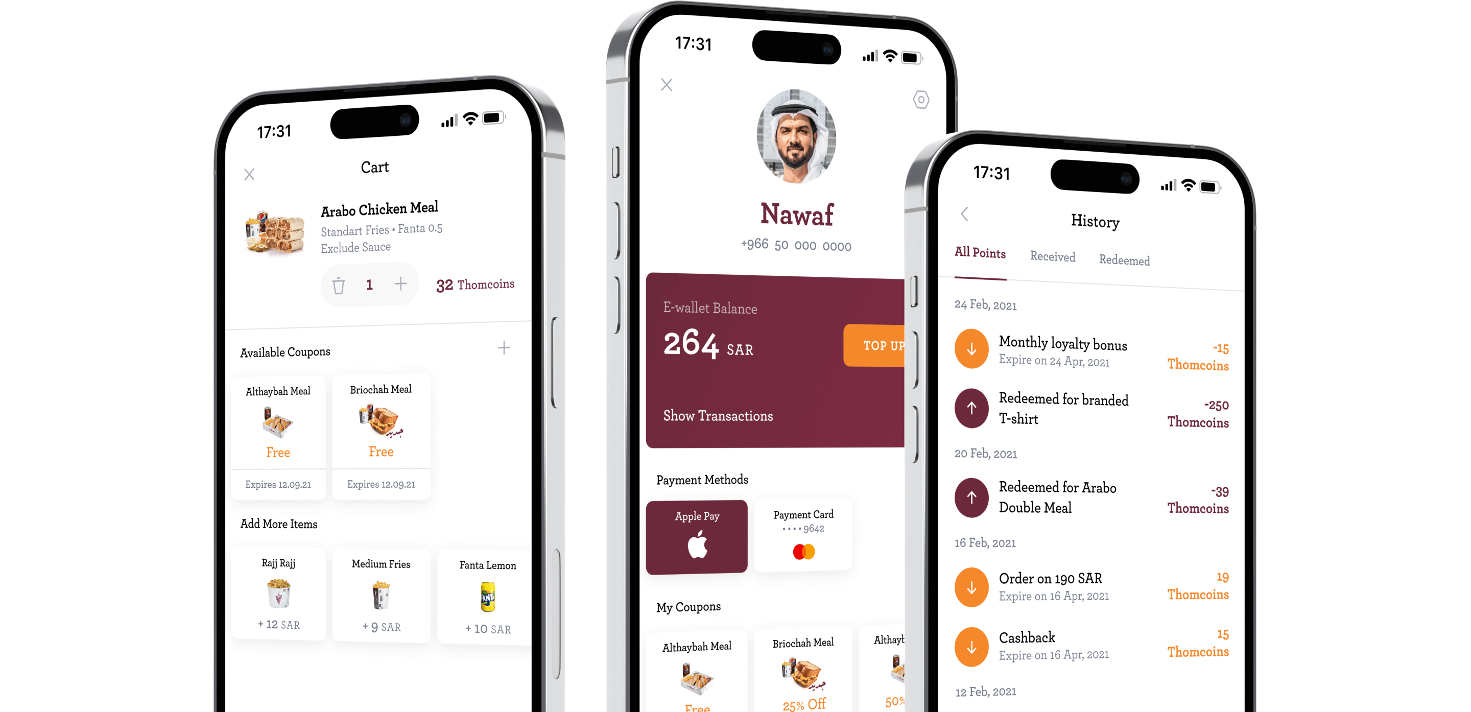
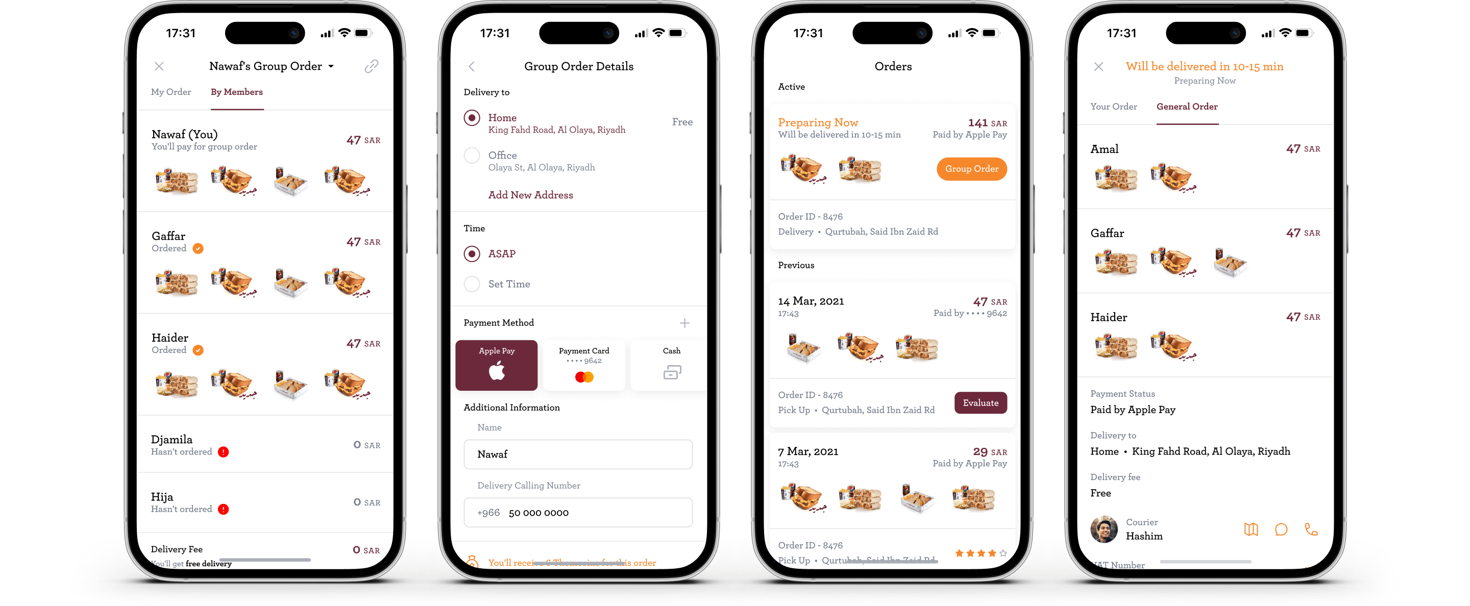
While completely redesigning current processes inside the app, we also added some completely new features - the most interesting of them are loyalty program, group orders and e-wallet.
Quick food ordering through App Clip
To make the user experience with Shawarmer even more convenient and efficient, we've designed an App Clip. This compact tool allows you to order your favourite dishes in just a few seconds without downloading the full app.

Uniqueness
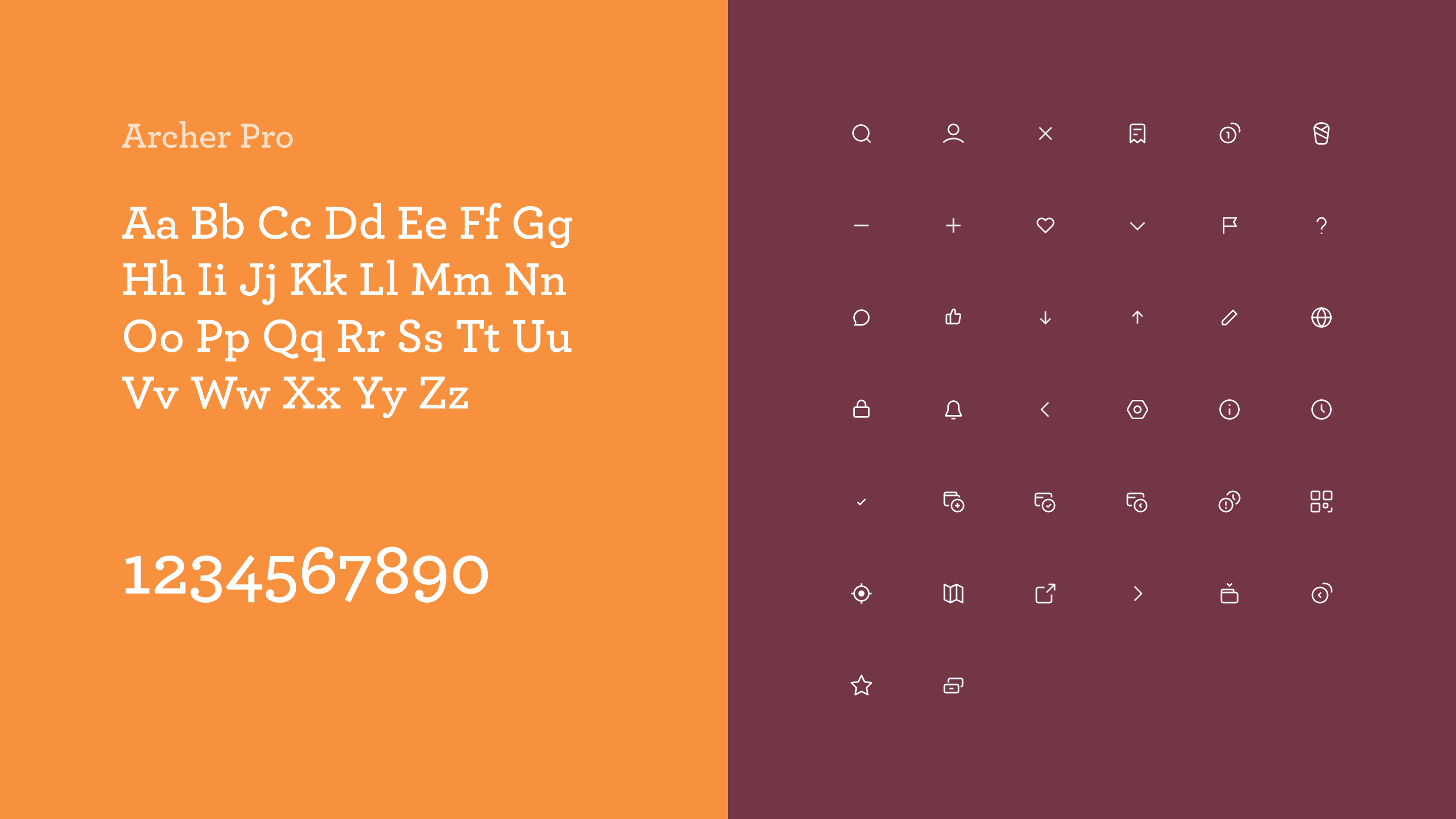
One of the requirements was to use the font and color palette from the Shawarmer app, that already existed. We added a unique set of icons, some illustrations, and new layouts, so even with some elements from the previous version, the app looks fresh and eye-catching.
Arabic Version
In the process of redesigning Shawarmer's mobile app, our team meticulously tailored the interface to cater to the Arabic-speaking audience, ensuring a user-friendly experience that aligns with local cultural.
Dark Mode
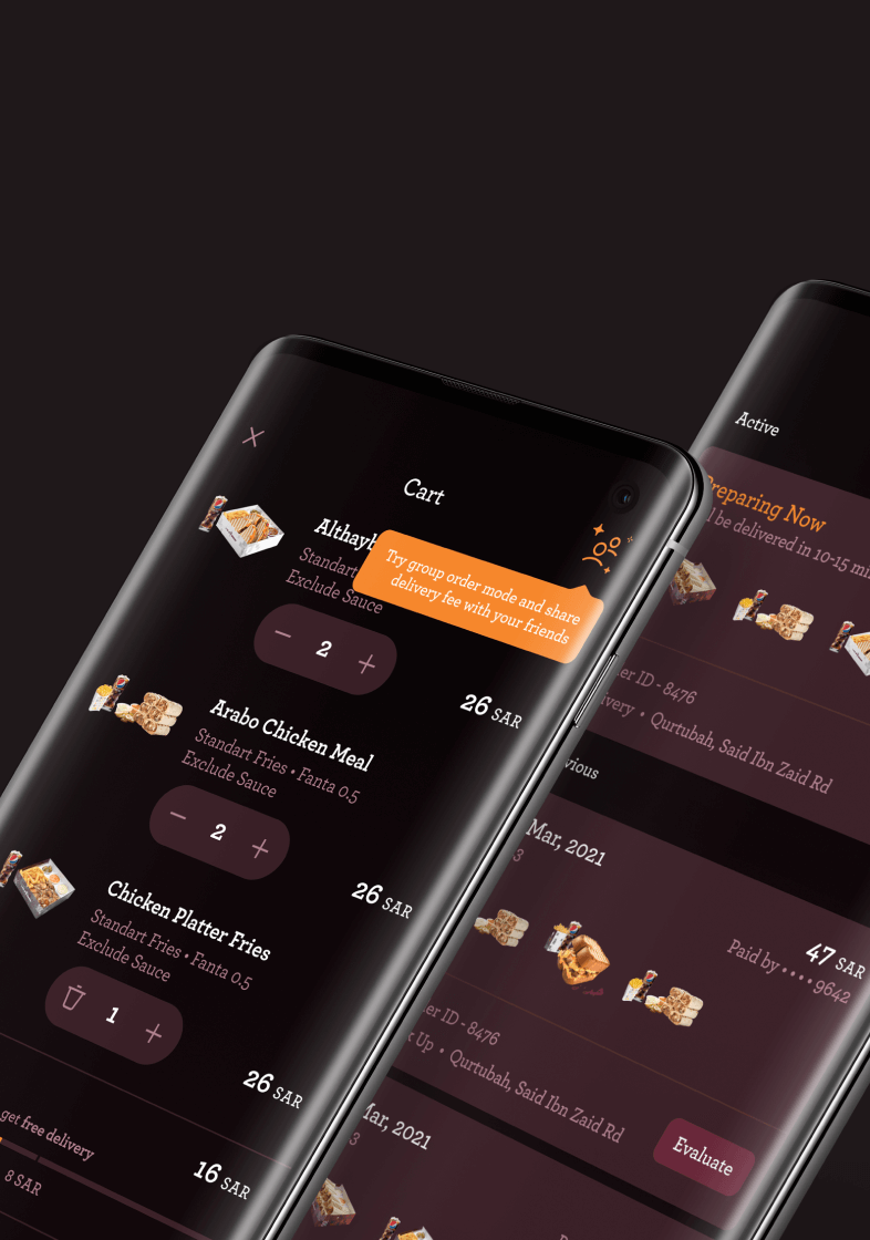
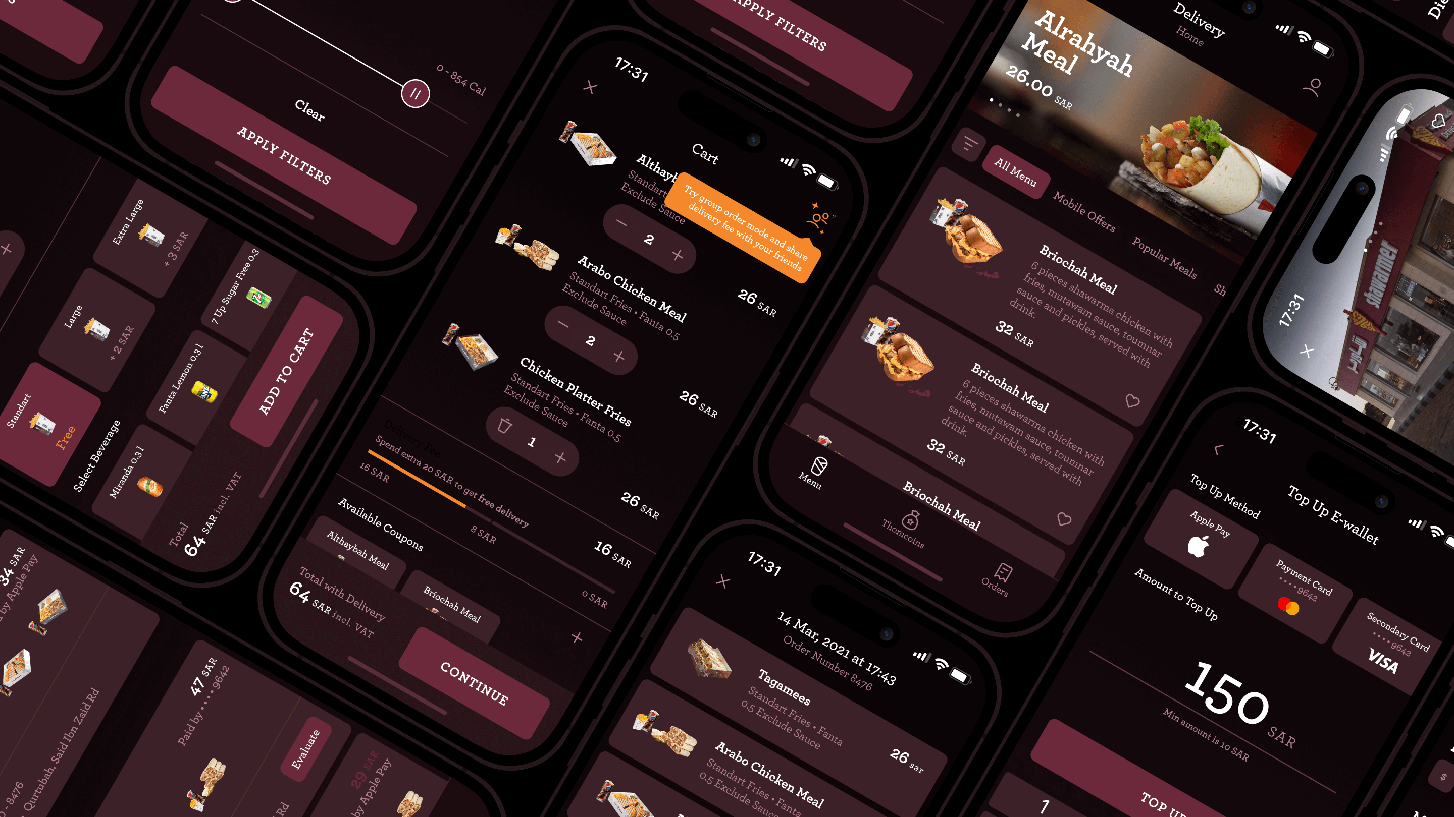
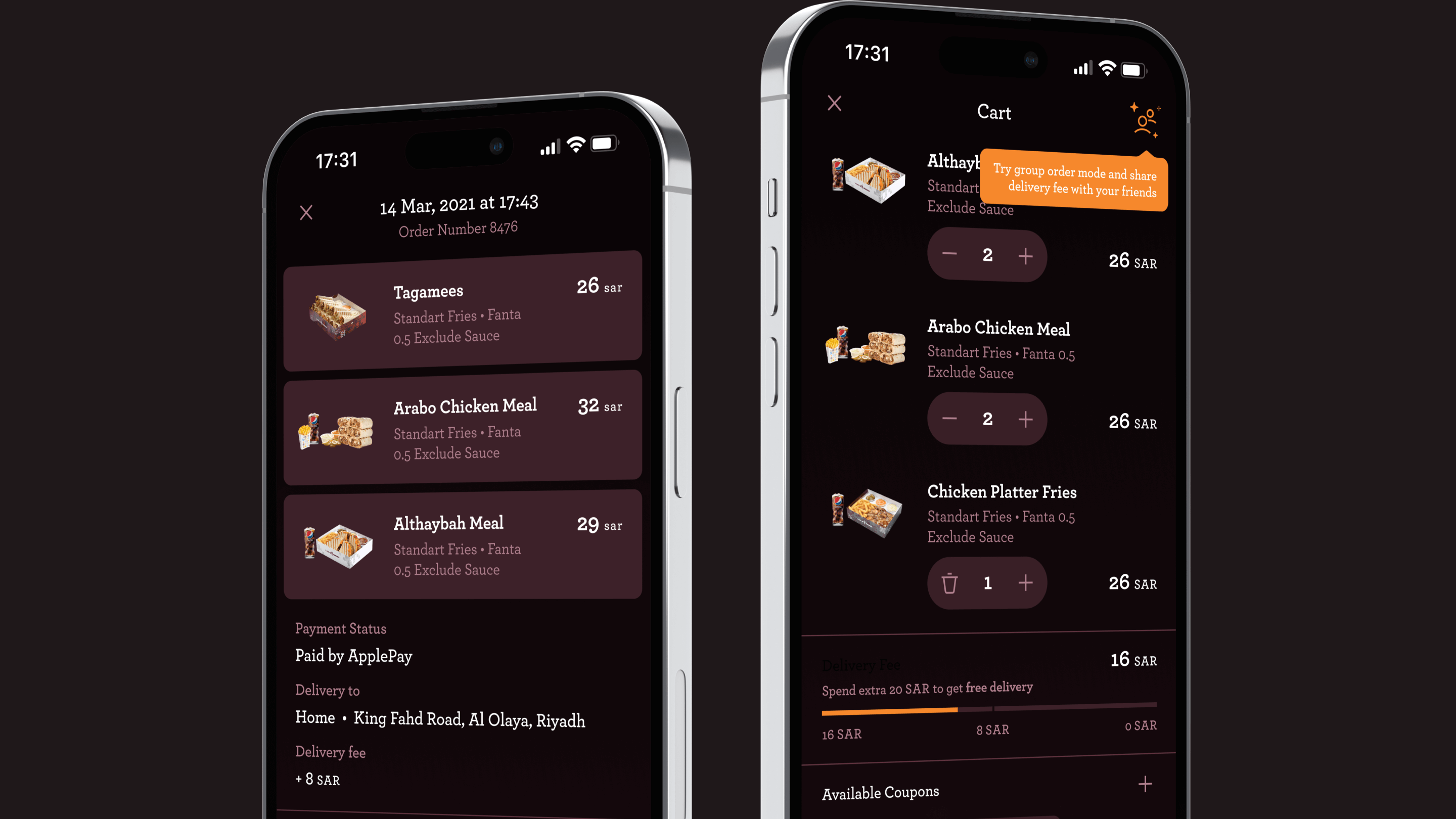
In Dark Mode, the system uses a darker color palette for all screens, views, menus, and controls, and it uses more vibrancy to make foreground content stand out against the darker backgrounds.
Summary
During the project implementation, we actively collaborated with the Shawarmer team, exchanging valuable insights. We thoroughly analyzed our UI/UX, participated in user interviews, and optimized the application's usability. This in-depth and methodical approach allowed us to enhance the user interaction with the app, meeting modern market demands and user expectations.
Contact us for more information on our services, for answers to questions or to order a design project.