

UX and UI Design for SaaS Platform
Locations
Singapore
Industry
E-Vouchers
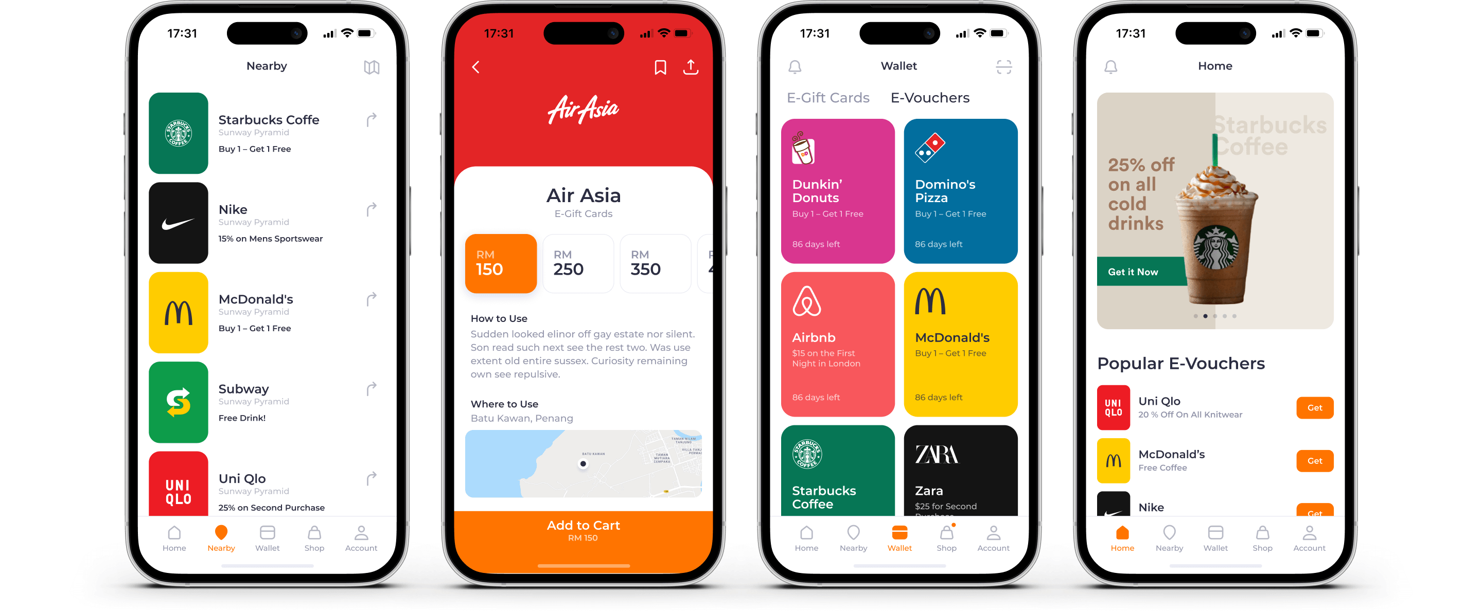
An innovative reward platform aimed at connecting businesses with new and relevant customers. This digital initiative modernizes traditional vouchers and loyalty programs, offering more effective solutions to boost sales and increase customer loyalty.
Problem
In today's market environment, maintaining and attracting customers is becoming increasingly challenging due to outdated voucher systems and loyalty programs. Many companies face the problem of unsuccessful marketing campaigns, losses from unused vouchers, and high costs associated with managing and distributing traditional loyalty programs.

Solution
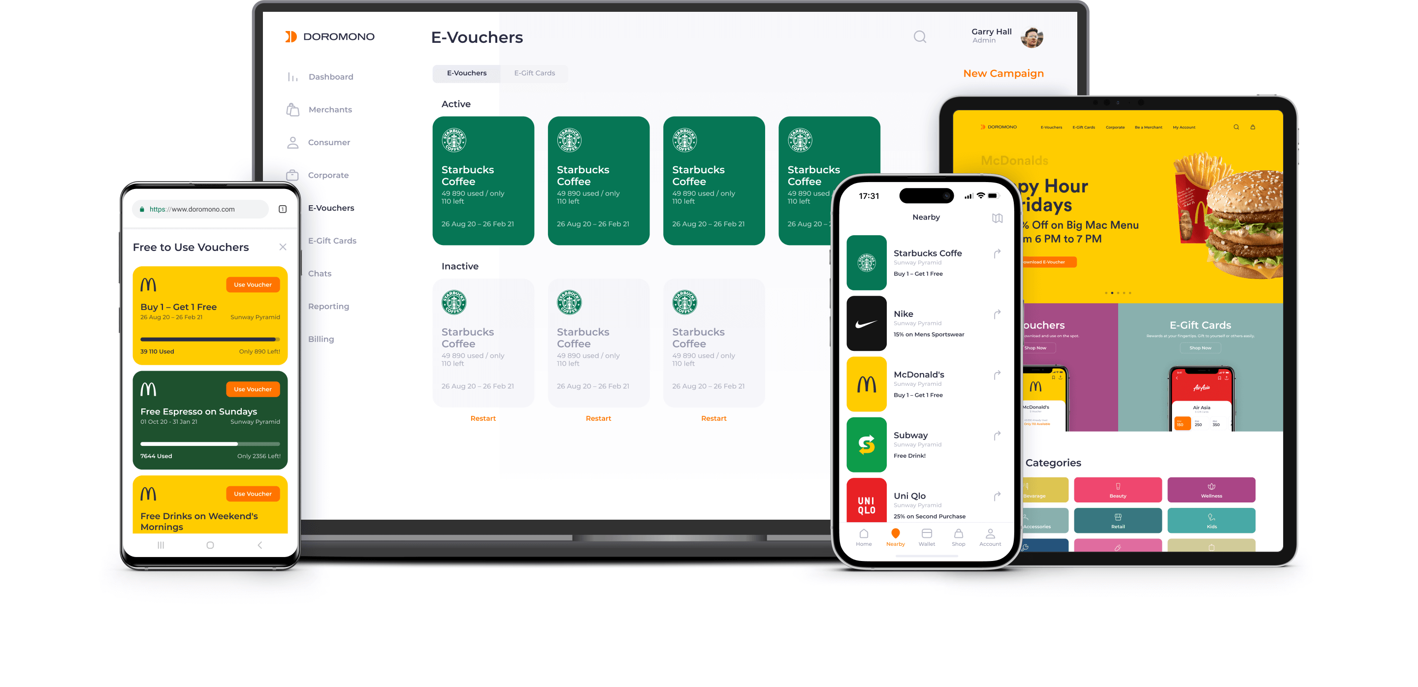
We designed an intuitive interface, transforming traditional marketing into a digital experience, making it easier for businesses to engage with old and new customers.
E-Vouchers
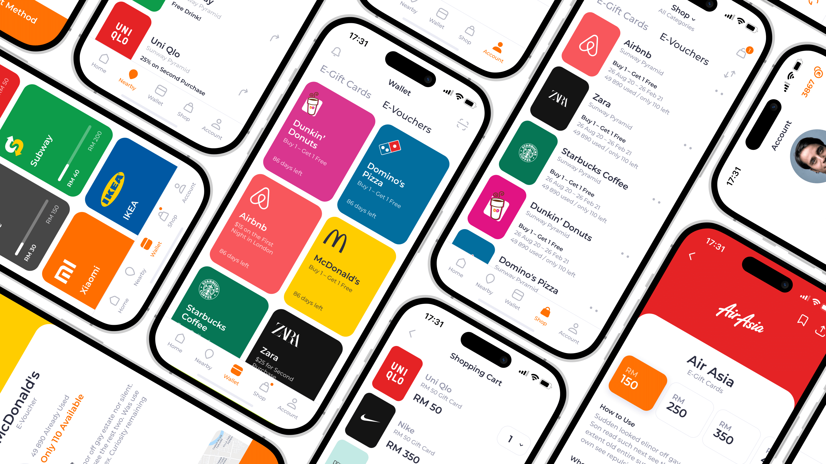
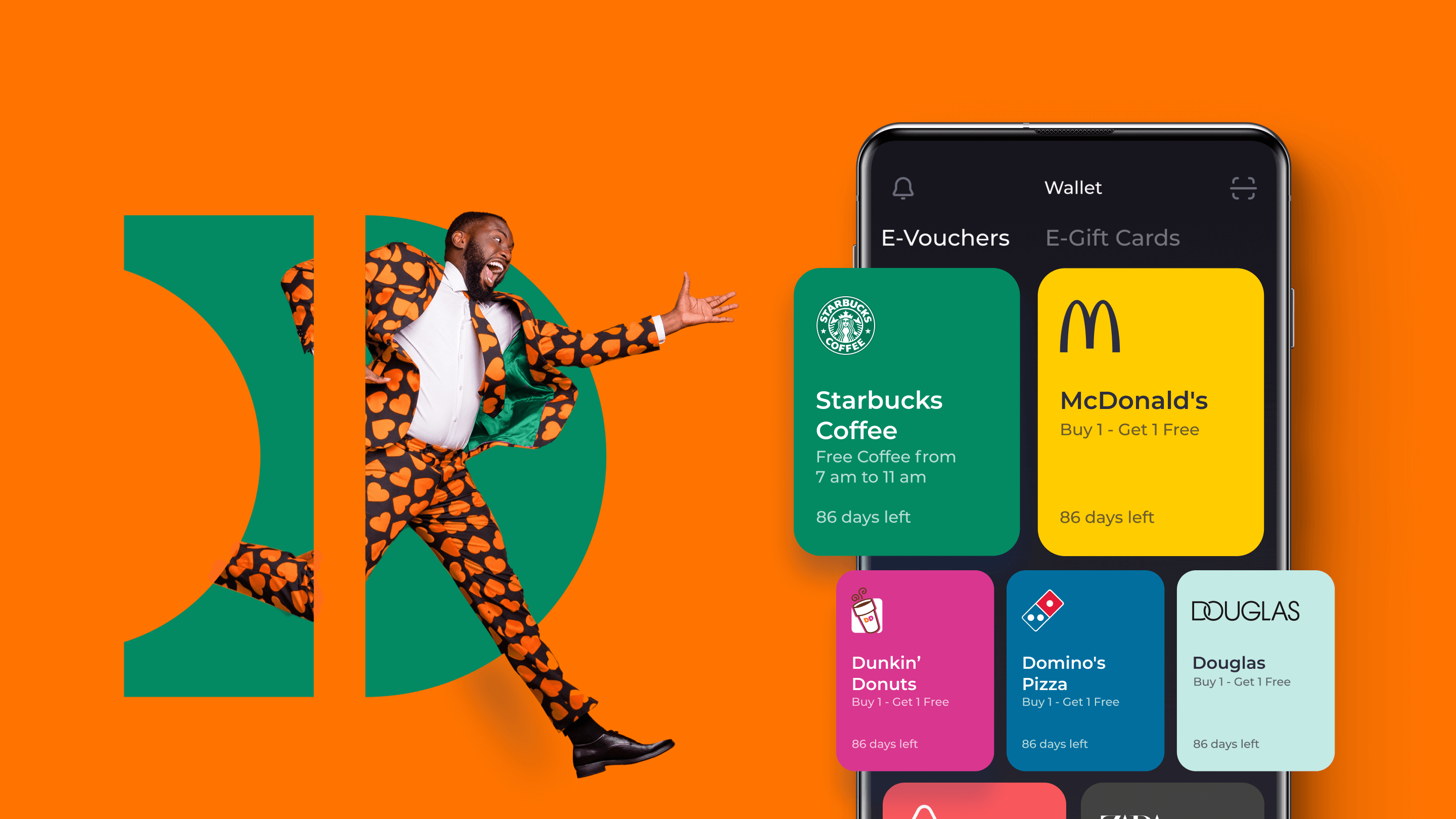
In designing the e-Voucher interface, we aimed to address the common issue of unused and expired vouchers. Our solution simplifies the gifting process for businesses and incorporates tracking features, ensuring an optimized user experience and a tangible way to measure engagement.

E-Gift Cards
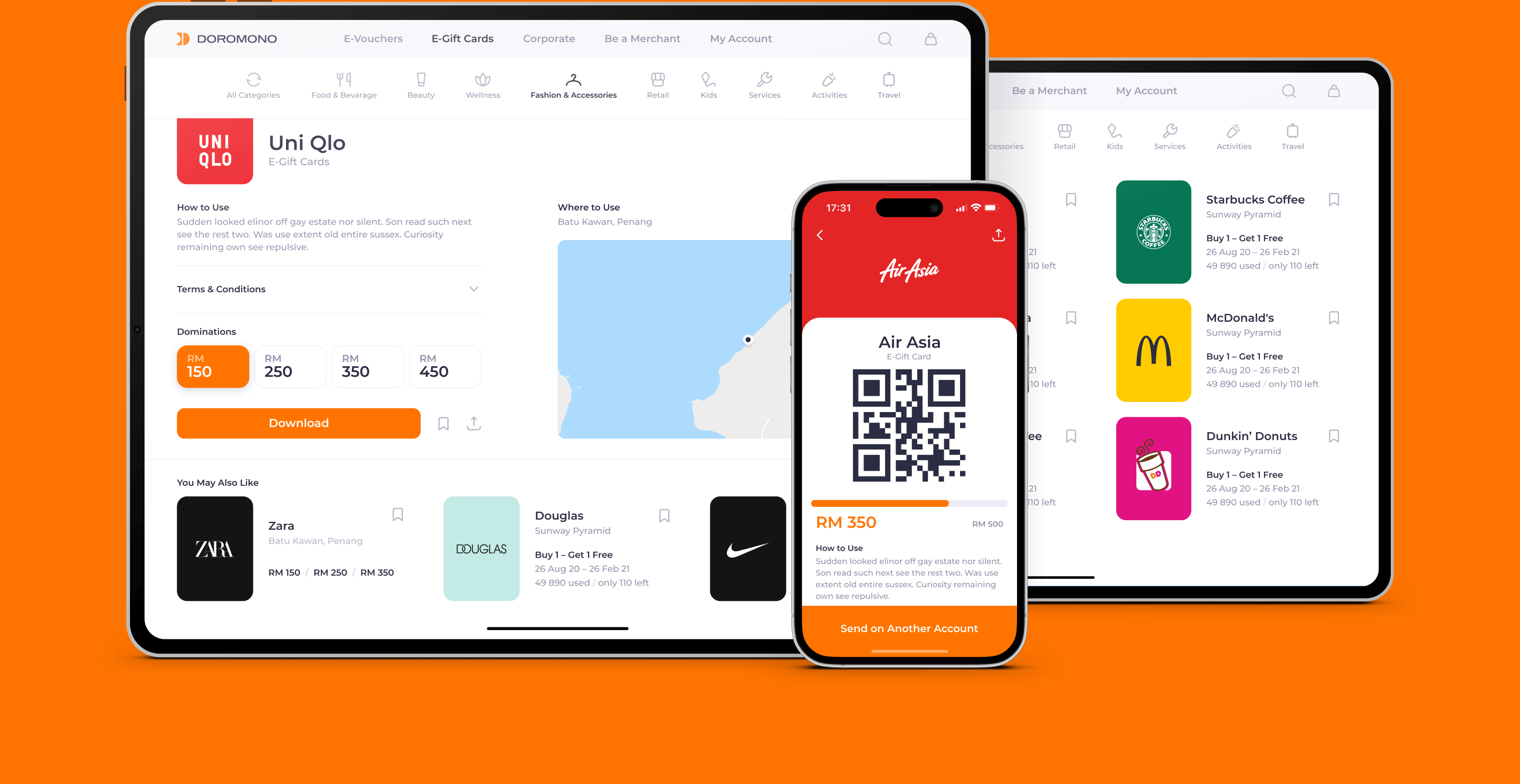
During the design of the interface for electronic gift cards, we prioritized simplicity and user-friendliness. Users can select, purchase, and use the gift cards either in the app or on the website, and the integrated tracking features add transparency to the process, enhancing overall user engagement.
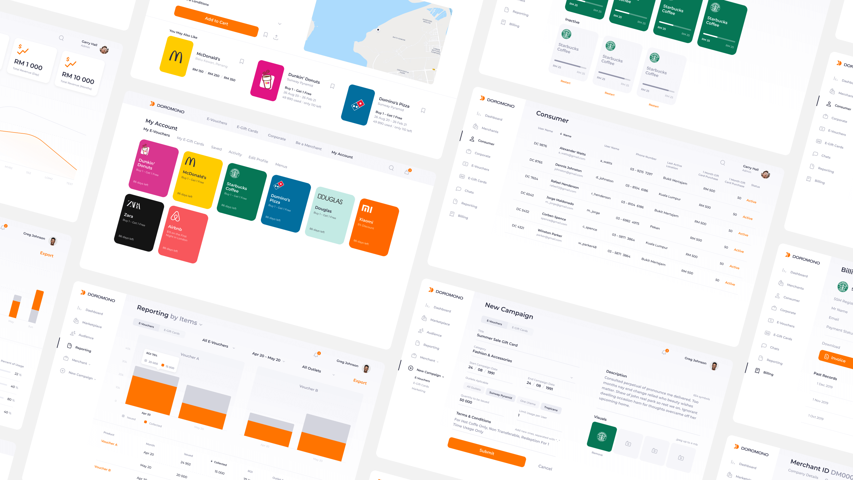
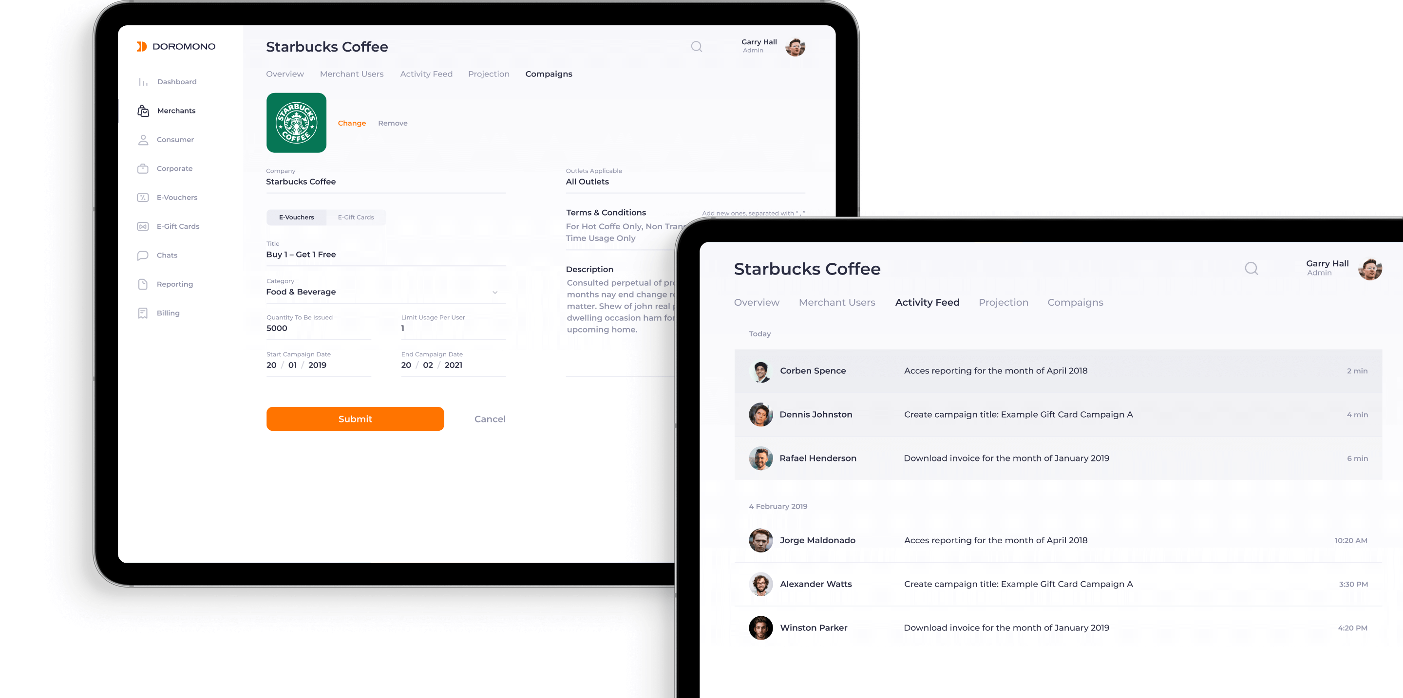
Campaigns
Using time-tested marketing tactics, we transitioned them into the digital realm. This move not only reduces expenses associated with printing but also tackles the issue of lost vouchers. We designed an interface that ensures an optimized and intuitive user experience.
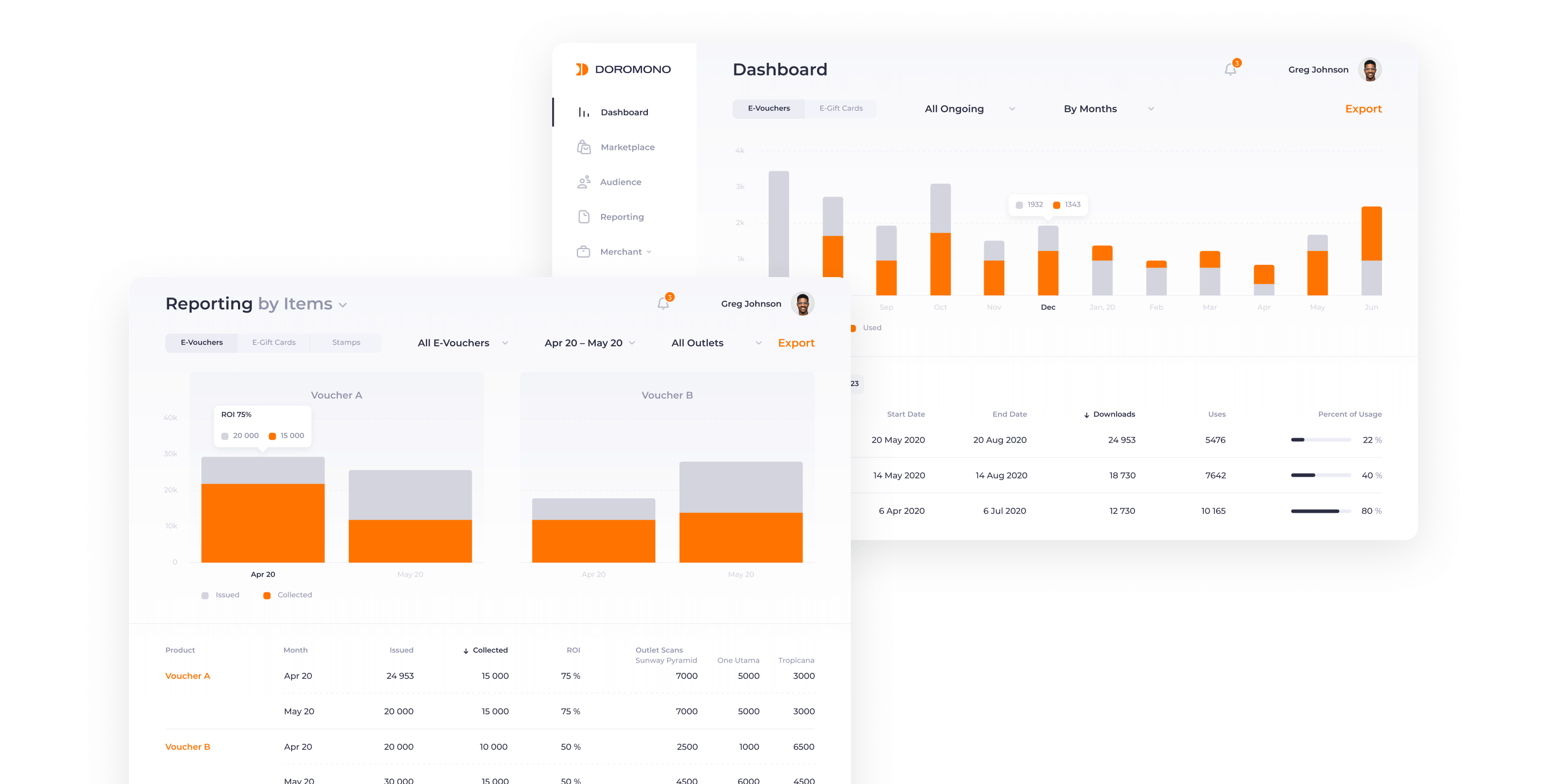
Dashboard
We designed a dashboard that, while being rich in information, also remains cleanly organized and easily navigable. With data essential for a triumphant campaign readily available, users can swiftly toggle between dates, campaigns, and view metrics - from campaign health to ROI. Our design accentuates an intuitive flow, empowering businesses to understand their target market with unprecedented clarity.
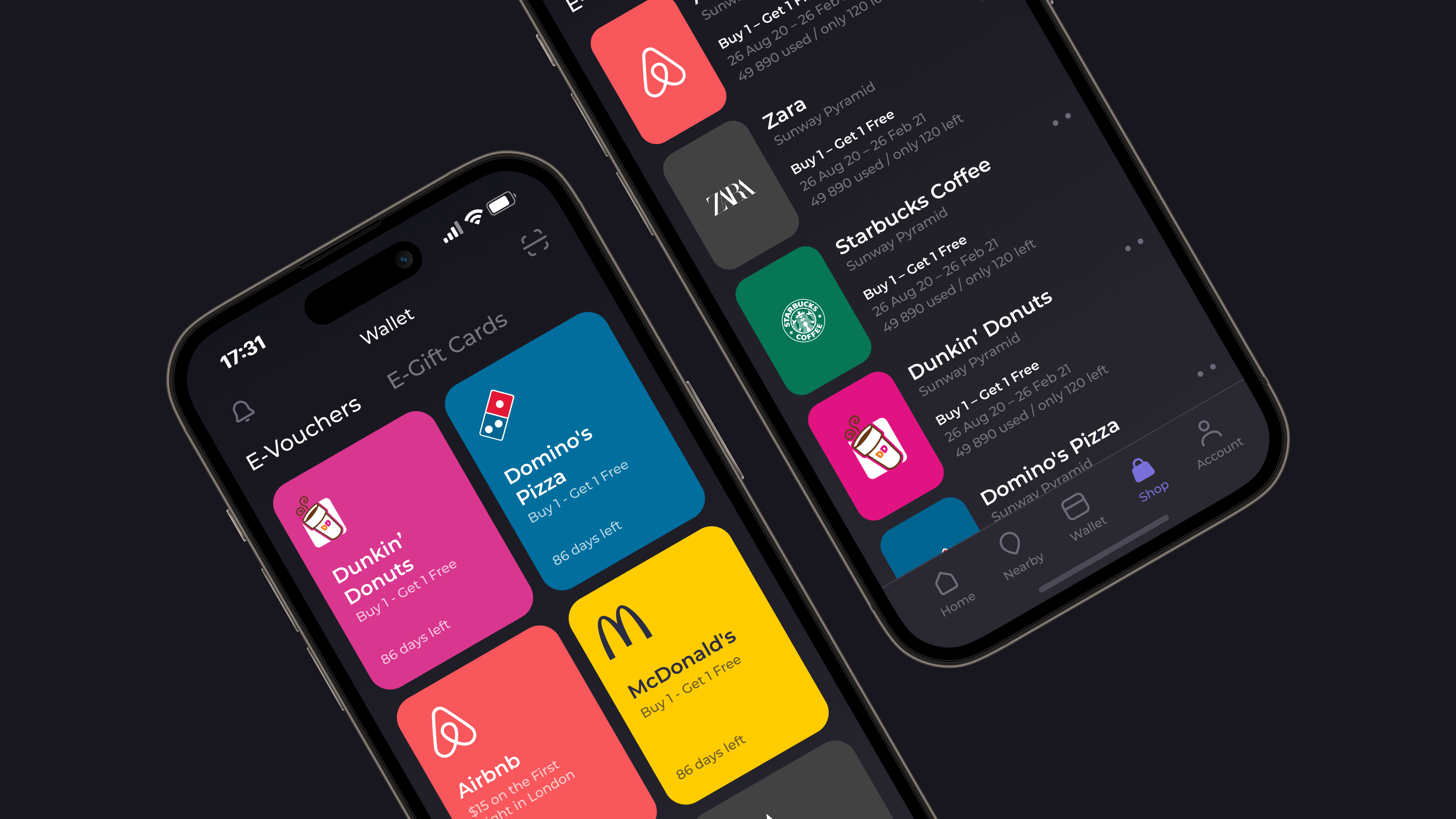
Dark Mode Design
In tune with modern design trends and user preferences, we introduced a dark theme for the Doromono interface. This not only offers a visually striking alternative but also enhances usability in low-light conditions, catering to a diverse range of user environments and preferences.
Branding
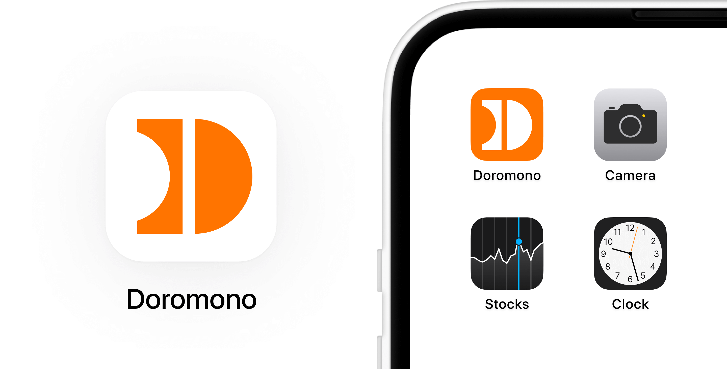
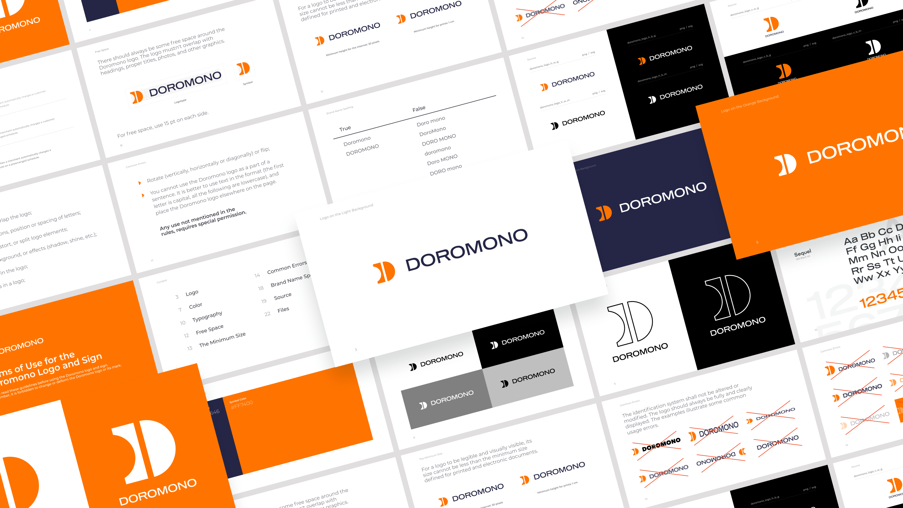
For the Doromono logo, we elegantly encapsulated the brand's essence by emphasizing the letter 'D', drawn from the company's name. The distinctive cutout, reminiscent of a voucher's notch, not only ties back to the brand's core functionality but also establishes an original and recognizable symbol, resonating with the brand's identity and mission.

Summary
By crafting an intuitive interface, we've empowered businesses to seamlessly connect with customers, fostering loyalty and driving sales through an enhanced digital marketing experience. This project epitomizes our commitment to innovative design solutions that streamline business operations and enrich customer interactions.
Contact us for more information on our services, for answers to questions or to order a design project.